
 Today is December 9 and I am fully immersed in the holiday season- in case you couldn’t tell from last week’s post. I’ve nearly completed all of my holiday shopping, the tree is up, and Christmas cards have begun to find their way in and out of my mailbox. Yes, indeed, the holidays are officially here, and I just love it!
But do you know who else loves the holidays?
Thieves, scammers, and phishers.
In this week’s post, I’ll discuss what web designers can learn from phishers.
What is phishing?
Phishing is the act in which thieves attempt to acquire usernames, passwords, credit card detail and other sensitive security information by impersonating a trusted entity. The first recoded use of the term “phishing” was made by Jason Shannon of AST Computers in 1995, and was coined because of the way thieves use “bait” to entice users.
What can we learn from phishing scams?
Let me first say that I truly don’t find anything remotely admirable about stealing users’ identities, personal information, or money. However, I must say that I am astonished with the detail that some phishers put into their work. Last week, our very own Duran Inci received an email linking to a phishing site. This email actually inspired me to write this article. Read on to see how this particular phishing scam works.
Step 1: The Email
First, the phisher sends an email directly to your address. Typically the subject of the email is an alert prompting an action, and the from address includes the domain of the company the phisher is masquerading as. In this case, the subject of the email was “Account Alert: Card Not Present Transaction” and the from email address was AmericanExpress@welcome.aexp.com.
Here is a screenshot of the email Duran received last week:

At first glance, you might think that this is a standard email, you may even be an American Express customer and have seen emails that follow this exact template. The email mentions that your account was “used to make a purchase, however the Card was not presented to complete the transaction.” It also gives details as to the amount, and the name of the store where the card was charged.
Since you didn’t make this purchase, you begin to panic – someone has stolen my credit card number and just spent over $7,000 at the Apple store!
As your life savings flashes before your eyes, you will probably click “View Account” hoping to rectify the situation.
What We Can Learn Here
Before we move on to the next step of this phishing scam, let’s take a look at all the things that made the user click through to view his or her account.
First, look at the branding on the email. The email uses the standard American Express logo, colors, and typography. Because we see this as recognizable, we immediately trust the email. Imagine if the American Express logo was shown in purple? Would you have noticed? Probably. But since the scammy email follows the branding guidelines, you trust it.
Next, the email uses diction that is considered professional and clear – exactly what you’d expect to receive from a credit card company. Even the subject of the email, “Account Alert: Card Not Present Transaction” encourages users to open the email, probably because of the word “Alert” but doesn’t immediately raise a red flag that the email is from a malicious source.
Finally, the email provides things like social media links, an invitation to start a new discussion on Twitter, and even a note to learn more about suspicious emails! All of these aspects encourage the user to trust the source and click the call to action.
Step 2: Log In To Your Account
Back to our American Express scenario. The user has just clicked the “View Account” call to action and been taken to the following page:
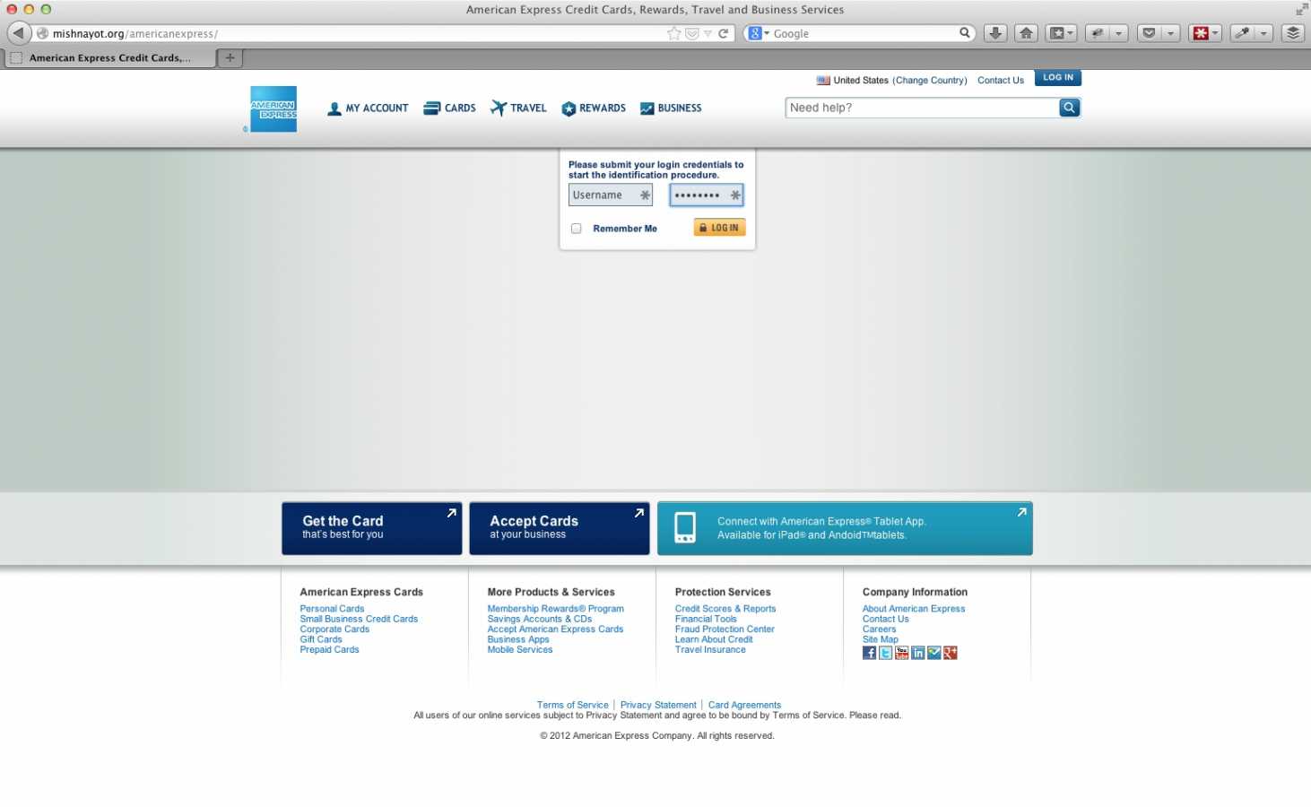
Again, clear and concise language tells the user to enter their username and password. Still panicky, the user inputs the information. But wait, can we get a look at the domain name?
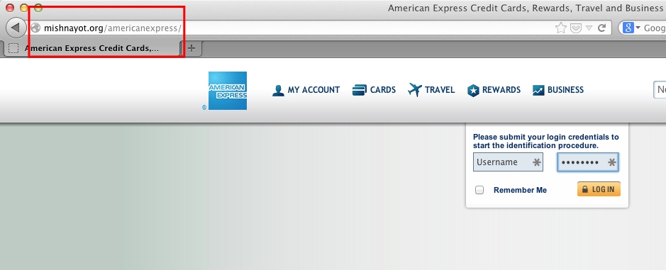
Mishnayot.org? Hmmm… I don’t recall having a credit card with them. Why would American Express have a subdomain there? I’ve got news for you folks, they don’t.
However, if we fail to look at the URL, which – let’s face it – most people don’t pay attention to, particularly during a hurried or stressful situation, this American Express page looks pretty legitimate. Let’s find out what makes this page legitimate and “user-friendly.”
What We Can Learn Here
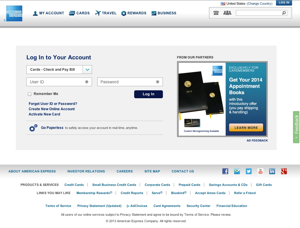
Once again, branding plays a huge role. For anyone who doesn’t believe that branding influences your daily decisions, here is your proof. The page is nearly identical to their current login page, shown below.
Another reason the user is happy to fulfill the call to action is because it is just so easy.
All I need is my username and password? I can do that!
And just like that, the thieves have your account information at their fingertips.
Consider this next time you are creating a contact or sign up form. How many fields is it? More than three or four, and your user is going to lose interest quickly.
One discrepancy I would like to point out in this scam is the copyright date in the footer. On the scammy site the year reads 2012, while on the legitimate site the year reads 2013. Learn from this. It is a web standard that your website demonstrate the current year in its copyright. It can demonstrate not only that your site is current, but in this case, also that your site is legitimate.
Step 3: Enter Security Information
Now that our poor user has logged into their “account” they can proceed to the next step where they will be robbed even further. Check this out:
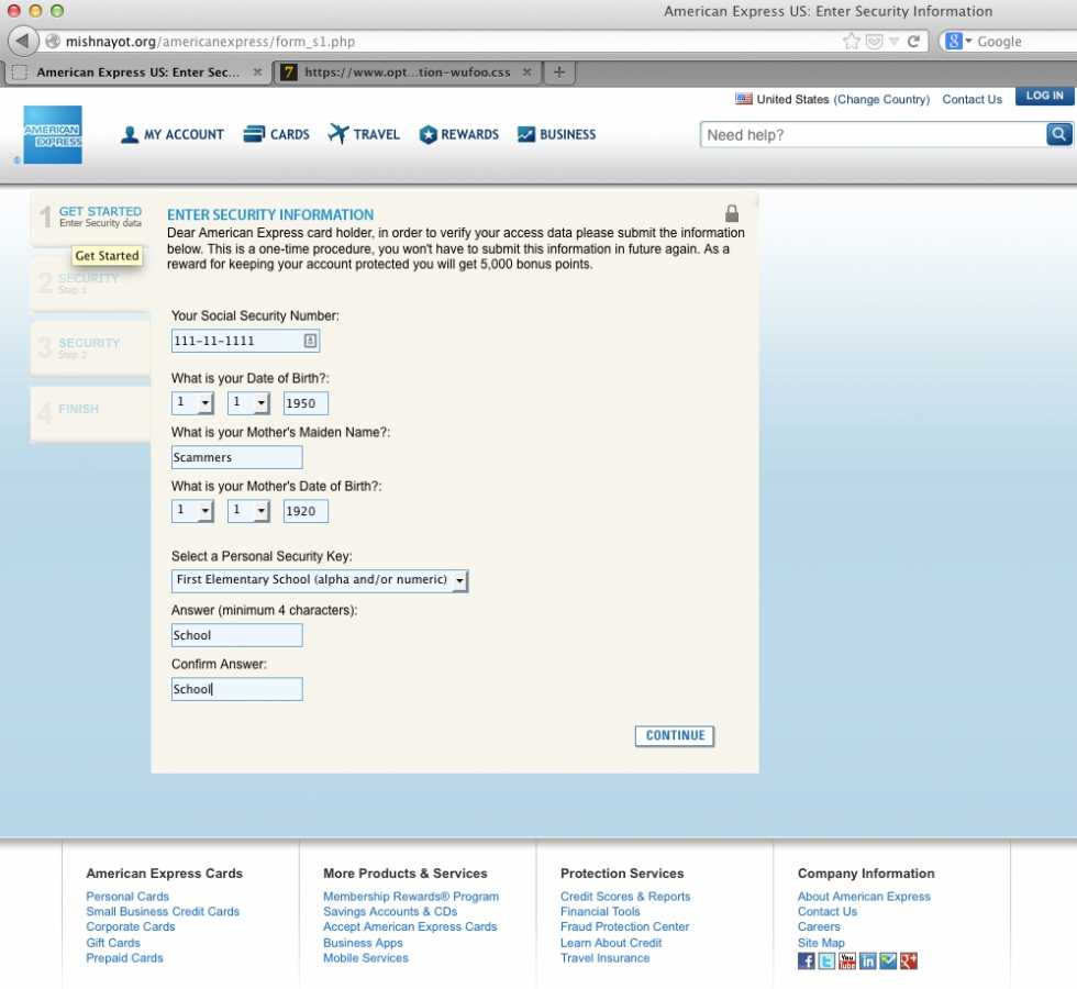
This page asks the user for your security information including:
- Social Security Number
- Date of Birth
- Mother’s Maiden Name
- Mother’s Date of Birth
- A Personal Security Key
Also, in case you didn’t notice, the message at the top of that page reads, “Dear American Express card holder, in order to verify your access data please submit the information below. This is a one-time procedure, you won’t have to submit this information in future again. As a reward for keeping your account protected you will get 5,000 bonus points.”
What We Can Learn Here
The branding continues consistently throughout these pages, so the user isn’t alerted in any way that this site is malicious.
In addition, the types of questions here are pretty standard and easy to answer. Most credit card companies ask for this type of information at some point, so the user can easily answer these questions.
For me, the most interesting part of this page is the text. In three small sentences, the user has been:
- reassured this site is trustworthy,
- informed that he or she will not have to complete this form more than once, and
- rewarded with 5,000 bonus points just for completing the form.
Finally, let’s take a quick look at the importance of symbols on this page. On the top right side of the form, there is a lock symbol. Locks have been associated with security long before the dawn of the Internet, but in recent years locks have been used to let users know that their information is safe. This imposter site knows this very well, and has thus included one.
Next time you are working on a site, a landing page, an email, or anything else be sure to understand that content needs to play a huge rule in the design. As you can see in this example, text works together with the layout to encourage a user to move forward.
Step 3.1 and 3.2: Enter More Security Information
As if these thieves haven’t received enough information from our poor user yet, they are going to go ahead and ask for the actual credit card number, security code, and expiration date.


What We Can Learn Here
On the next two pages, we are shown a photo of an American Express card with empty boxes where the user is expected to add his or her card information and ID number. Because the placement is the same on an actual card, it is easy for the user to understand which numbers should be placed in which boxes.
Another aspect of this form, which isn’t shown in this screenshot, is that the form actually validates the text you enter. For example, if you don’t enter a credit card number that begins with “34” or “37” (all American Express cards begin that way) the form will ask you to enter a valid number.
By using forms that validate, the phishers assures the user that they are a trusted, knowledgeable source.
Step 4: Thank You
Once the users have entered all of their credit card information, they are taken to a success page, where they are reassured that their profile has been updated, that they can fully access all American Express card services, and reminded about the 5,000 bonus points they just earned! After this brief message, the user is redirected to the real American Express homepage, unknowing that they’ve been completely scammed.

What We Can We Learn
Thank you pages are important in relation to conversion rates. It is your last chance to reassure your user that he or she made a good decision. By informing the user that the process is complete and reminding him or her of the benefits of completing the process, the user can rest assured that he or she made the right decision.
The Takeaway
As I mentioned earlier, this week’s post isn’t meant to glorify phishing scams in any way. On the contrary, I hope that you walk away from this article and shop a little bit more carefully this holiday season. Check the URLs of the sites that are asking for sensitive information, make sure their branding is consistent, and don’t give any information away without being 100% comfortable that it will be kept secure.
For the designers out there, I’d like to encourage you to design better, more secure sites and tools. Our users shouldn’t have to worry about whether or not they’ll be ripped off. I also want to encourage you to study other designers – yes, even ones whose intentions are not good – to understand what makes users click, what users like, and what users dislike.
Knowledge is Power
If you’d like to help users from falling into phishing scams like the one I’ve mentioned today, please spread awareness by sharing this post on Facebook, Twitter or Google+.
For more information on how to make your site more secure and user-friendly, contact Optimum7 today for a free consultation.