In this article we’ll quickly walk-through the process of creating a CSS3 animation of an AT-AT Walker from The Empire Strikes Back. We’ll start off by reviewing some CSS3 properties that made this animation possible. Then, follow up with a list of the sections required to construct the AT-AT and the CSS3 code to move each section. I wont go too deep into the explanations of CSS3. There are various resources online to get you up to speed with CSS3.
Lets review some of the important CSS3 properties:
TRANSFORM: TRANSLATE(X Y) ROTATE(X)
-webkit-transform: translate(x,y) rotate(x)
These CSS3 transform properties are pretty self explanatory. Translate allows you to move an object left, right, up, down and the rotate property, well… rotates.
@-KEYFRAMES ‘ANIMATION-NAME’
@-webkit-keyframes 'bounce' {0 {top: 20px;}

40% {top: 0;}

60% {top: 20px;}

100% {top: 0}

}

#ball:hover {

-webkit-animation-name: bounce;

-webkit-animation-duration: 4s;

-webkit-animation-iteration-count: infinite;

}
The keyframes function/property allows us to define a keyframe animation over a specified amount of time. Let me describe how the keyframe property works by explaining the code above of the bouncing animation.
At 0%, the keyframes function is placing the object 20px from the top. 40% into the animation that object should move up to be 0px from the top. At 60% into the animation, the object should move back down 20px from the top. By the time the animation gets to 100% it should move back to 0px from the top again. In the second rule we apply this animated behavior to the #ball element upon hover.
When the user hovers over the link with an id of ‘#ball” it will activate the bounce function. We have specified that the animation duration should last 4 seconds. Meaning that it will take 4 seconds for the animation to run from 0% to 100%. Finally we allow the animation to run infinitely. If we wanted the ball to only bounce a couple of times and then stop we would just put a 1 or 2 in the webkit-animation-iteration property.
TRANSFORM-ORIGIN: X Y
-webkit-transform-origin: x y;
This is an extremely important property for animation. The transform origin property allows you to change the point from which animation or transformation for any given object occurs.
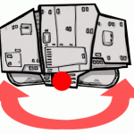
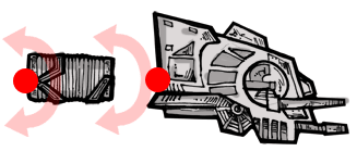
 Figure (a – Here you see the transform origin is in its default location in the center of the arm image (red circle). If we where to rotate the arm using this transform origin point. The arm would spin around from the center. Like the blades of a helicopter.
 Figure (b – We have moved the transform origin point to the top, center of the arm image. Now if we rotate the image from this transformation point it would rotate correctly like a properly hinged arm.
Lets Move On to the AT-AT, Its Sections and the CSS3 Properties That Apply to Those Sections:
 THE SHELL – one png image; keyframes and animated rotation properties are applied to coincide with the movement of the legs. The shell will sway a little as each leg steps forward.
@-webkit-keyframes rotate-shell {

0% {-webkit-transform: rotate(0deg);}

20% {-webkit-transform: rotate(3deg);}

40% {-webkit-transform: rotate(0deg);}

50% {-webkit-transform: rotate(0deg);}

70% {-webkit-transform: rotate(-3deg);}

90% {-webkit-transform: rotate(0deg);}

100% {-webkit-transform: rotate(0deg);}

}

#atat #shell {

-webkit-animation-name: rotate-shell;

-webkit-animation-duration: 4s;

-webkit-animation-iteration-count: infinite;

}
 THE LEG (Thigh, Knee, Shin, Foot) – The leg animation is the crux of this whole experiment. The leg is comprised of a div with 3 child divs nested within it. Thigh, Shin, Knee and foot. The foot is a child of the shin div. The shin div is a child of the thigh div. Finally the thigh div is a child of the leg div. By nesting the divs in this manner, we can mimic the functionality of a skeleton.
In addition to nesting these divs, we moved the transform origin points from the center of the leg divs to the top, center. This allow us to create hinges or bones. As the leg div steps forward, the thigh div rotates x degrees on its transform origin point, rotating the shin and foot along with it. The shin already moving along the rotation point of the thigh begins its own rotation from its own transform origin point, rotating the foot along with it. The foot moving along the rotation path of the thigh AND the shin begins its own rotation cycle. This gives the legs that robotic, hinged look.
For each leg, the animation lasts 8 seconds. Since I needed only one leg to move at a time. I split the animation into four different parts. For the first leg the animation keyframe begins at 0% and ends at 25% (2 sec), the second leg begins its animation cycle at 25% and ends at 50%, the third leg begins at 50% and ends at 75% and the fourth begins at 75% and ends at 100%. By staggering the keyframe animation like this I was able to mimic the movement from the ‘Empire Strikes Back’ movie where the AT-AT’s are only moving one leg at a time.
(I’ll provide the CSS3 code for just one of the sections. All the leg sections move using the same strategy just different rotation values and timing.)
 @-webkit-keyframes shin {

0% {-webkit-transform: rotate(0deg);}

20% {-webkit-transform: rotate(0deg);}

30% {-webkit-transform: rotate(23deg);}

50% {-webkit-transform: rotate(0deg);}

100% {-webkit-transform: rotate(0deg);}

}

#atat #leg-a .leg-shin {

-webkit-animation-name: shin-a;

-webkit-animation-duration: 7s;

-webkit-animation-iteration-count: infinite;

-webkit-transform-origin: 50% 0;}
 THE HEAD (neck and skull) – The animation on this is minimal. The skull and neck extend out of the shell of the at-ats body. then the skull section swivels up and down a bit.
@-webkit-keyframes rotate-head{

0%{-webkit-transform:rotate(0deg) translate(0px,0px);}

40%{-webkit-transform:rotate(10deg) translate(15px,5px);}

80%{-webkit-transform:rotate(-5deg) translate(8px,5px);}

100%{-webkit-transform:rotate(0deg) translate(0px,0px);}

}

#atat #head {

-webkit-animation-name: rotate-head;

-webkit-animation-duration: 7s;

-webkit-animation-iteration-count: infinite;

-webkit-transform-origin: 0 50%;

}
Well, that’s it. That is the basic concept to animating a diabolical war machine using only CSS3. Feel free to post a comment or question. I’ll make sure to try and post a response quickly. Take another look at the demo, dive into the code and try to build your own.
You can see examples of our custom programming work using css here.


