I have a lot to be grateful for this year. I’m not saying this to brag, I’m saying this because I know it to be true. I have a roof over my head, a great job, good friends who make me laugh, and family to support me when the road gets a little bumpy. More importantly, I know that not everyone has been as lucky as I have been this year. Because I feel especially fortunate this year, I have decided it is more important than ever for me to give back to those in need.
Typically, charities and other non-profit organizations receive more attention during the holiday season than any other time (with the exception of natural disasters). In fact, in a survey by Ask Your Target Market, 57% of respondents said they donate to charity in some way during the holiday season. You can even see a steady increase in Google Trends for general terms like “charities,” “donate money,” “give to charity,” and “volunteer work” starting in late November/early December.

Google Trends for term “charities” in the US for the past 12 months, increasing in late November to early December

Google Trends for term “donate money” in the US for the past 12 months, increasing in late November to early December

Google Trends for term “give to charity” in the US for the past 12 months, increasing in late November to early December

Google Trends for term “volunteer work” in the US for the past 12 months, increasing in late November to early December
I have always felt that giving back to the community doesn’t just have to be about donating food to the hungry, or giving money to those in need. It can also be about focusing your skills and talents in such a way that you don’t expect anything in return. Since I am most passionate about design, I’d like to devote this week’s article to web design and non-profit organizations. I will discuss the tips for designing a non-profit site, spotlight well done designs, give a short critique of 5 of the largest charities in the country, and provide examples of superb sites to inspire your next project.
Designing for Non-Profit Organizations
All too often, non-profit organizations neglect their websites because of budget and time constraints. To provide some assistance to designers who are working to create a non-profit site, I have created a list of eight cost-efficient tips for crafting a successful non-profit website.
1- Use a CMS
Freshness matters. Updating your site on a regular basis can give you a better chance of showing up in the SERPs. While freshness is only one of the over 200 signals that Google uses to rank pages, think about how freshness impacts your user. Have you ever conducted a web search, and the first result is from 2009 and the fourth is from this month? You probably chose the one that was more recent, even though it was actually ranked lower. This is a common occurrence because people are almost always in search of the most up to date information.
To increase the likelihood that your client will regularly update their site, you need to make it easy. The most efficient way to do this is to build the site on a CMS, such as WordPress.
If your client doesn’t know how to use WordPress, a walkthrough might be necessary. For a guide to giving a great walkthrough to WordPress newbies, please see my recent article, Introducing New Clients to WordPress complete with a free WordPress walkthrough checklist!
2- Make it Easy to Donate
Donations are obviously a large part of what keeps non-profits afloat, so the ease of which users can contribute is vital. Make sure the “Donate” call to action is available on each page. MIFA presents the “Donate” button four times on the homepage alone, without becoming overwhelming.

Another way to increase the chances of gaining a donation is to provide the user with options. For example, the Invisible Children website allows users to choose whether they’d like to give a onetime gift, a monthly donation, or provide a scholarship to fund education initiatives in northern Uganda.

Finally, security is a very important aspect of the online donation process. I mentioned in my last article that eCommerce sites need to instill trust in their customers in order to complete a sale. Non-profit sites are no different. Greenpeace displays the “Norton Secured” logo, complete with a link describing the security system that the site uses, and a link to information about SSL certificates.

3- Make Your Site Media-Friendly
In order for journalists, bloggers, etc. to spread the word on the wonderful things your non-profit is doing, they need to know who to contact. In the main navigation of the Americares site is a “News” section. Within this menu are all things media-related: a list of contacts, in-house experts, an emergency blog, a photo gallery, videos, press releases, and more. Because they have provided everything we could possibly need, they will most likely gain exposure. Journalists often work under tight deadlines- they don’t have time to search high and low for a phone number. If you gather the right information, and organize it correctly, people will be able to contact and connect with you much more efficiently.

4- Be Clear
If I don’t understand what your organization does, whom it benefits, or why I should help within the first 25 seconds or so of visiting your site, you’ve lost me. You need to state a clear purpose of what you do and whom you help. You can state a purpose by including information in the logo, like the Michael J. Fox Foundation or explaining it in the header, like Product (Red), or displaying information in a banner like Change.org.

")

In addition to stating a clear purpose, it is important to give a background or history of your NPO. Here you can mention when the organization was founded and why, major breakthroughs, future goals, etc. Including this information will make your organization feel more personable and trustworthy.
5- Encourage Volunteering
It’s no secret that most NPOs run almost purely on volunteer work. Just like the donate and media sections of your site, you need to make it easy for users to find out more about getting involved. A great example is NYC Service. On the homepage, it allows users to search for volunteer work by filtering results according to their interest: education, health, strengthening communities, etc.

6- Consistency
Just like any other client, consistency in branding is imperative. If your site, logo, social media pages, and email newsletters differ, you will lose credibility. The easier your brand is to identify, the more likely you are to gain trust, and be remembered. For example, LIVESTRONG has done an excellent job maintaining their brand across all platforms.


7- Blog & News
As I stated in tip #1, freshness is important to search engines and users alike. Creating a news section, maintaining a blog, or displaying a regularly updated calendar of events will help your users stay up to date, and ultimately encourage interaction.
8- Photography and Stories of Lives Changed
Just as testimonials inspire users to purchase a product, NPOs use touching photos and stories of lives changed to inspire users to volunteer and donate. Covenant House features a page full of photos and touching narratives about kids the organization has helped. I also like their locations page, which features photos jumbled together to form countries, rather than an actual map.


Analysis of Top 5 Charities in the US
Keeping those eight tips in mind, I have analyzed the Forbes’ Top 5 Largest US Charities for 2012. I am critiquing here based on the criteria I discussed above. These charities do excellent work every day, and I’m not here to judge. However, I’m a firm believer in the idea that there is always room for improvement, and so I have made a few suggestions below that I feel would enhance the sites, and ultimately provide a better user experience.

What They’ve Done Right:
- Ability to search based on location
- Consistency in branding
- Statement of longevity (example: “125 years of service!”)
- Clear call to actions
- Utilizing social media
- Frequently updated blog or news section
- Clearly stated purpose or mission
- Good use of photography
- Events section
- Use of videos
- A logo that assures security or credibility (examples: Better Business Bureau, Norton Security)
- Ability to sign up for updates or a newsletter
- Donor-friendly
- Media-friendly
- Volunteer-friendly
- Real-life stories
Suggested Improvements:
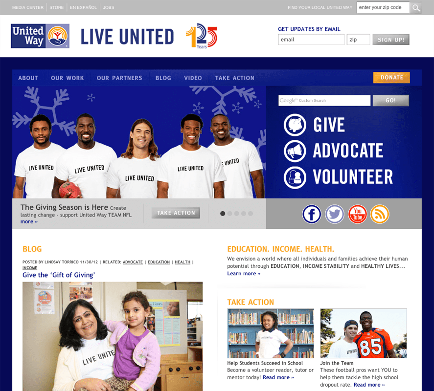
I love the overall design of the site. It’s clean, easy to use, and the branding is consistent across the board. I would suggest using a taller footer (because as you all know from my recent article, I love tall footers) and because they could provide plenty of useful links, and free up some Internet real estate at the top of the page. I would also suggest adding a “stories” section to the site, to demonstrate real people that the United Way has helped.

What They’ve Done Right:
- Ability to search based on location
- Consistency in branding
- Clear call to actions
- Utilizing social media
- Frequently updated blog or news section
- Clearly stated purpose or mission
- Good use of photography
- Use of videos
- A logo that assures security or credibility (examples: Better Business Bureau, Norton Security)
- Donor-friendly
- Media-friendly
- Volunteer-friendly
Suggested Improvements:
I feel like this site is a bit dated. The colors are muted, and while the design is functional it is not as aesthetically pleasing as it could be. I also noticed that there isn’t an events section, an option to sign up for a newsletter, or a real-life story section. The addition of these three aspects could greatly increase the emotional value of the site.

What They’ve Done Right:
- Statement of longevity (example: “125 years of service!”)
- Clear call to actions
- Utilizing social media
- Frequently updated blog or news section
- Clearly stated purpose or mission
- Good use of photography
- Events section
- Use of videos
- A logo that assures security or credibility (examples: Better Business Bureau, Norton Security)
- Ability to sign up for updates or a newsletter
- Donor-friendly
- Media-friendly
- Volunteer-friendly
Suggested Improvements:
My biggest problem with this site is that their branding is not 100% consistent. Their website features lovely purple and lavender hues. But when you travel to their Twitter or Facebook page, everything is a dark shade of blue. Similar to the United Way and the Salvation Army, they also don’t provide a section for real-life stories.

What They’ve Done Right:
- Ability to search based on location
- Consistency in branding
- Clear call to actions
- Utilizing social media
- Frequently updated blog or news section
- Clearly stated purpose or mission
- Good use of photography
- Events section
- Use of videos
- A logo that assures security or credibility (examples: Better Business Bureau, Norton Security)
- Ability to sign up for updates or a newsletter
- Donor-friendly
- Media-friendly
- Volunteer-friendly
- Real-life stories
Suggested Improvements:
I really like the design of the site. The use of photography and different textures adds interest, and they provide multiple logos that assure their credibility. My only critique is that they don’t state prominently how long they have been providing service.

What They’ve Done Right:
- Ability to search based on location
- Consistency in branding
- Clear call to actions
- Utilizing social media
- Frequently updated blog or news section
- Clearly stated purpose or mission
- Good use of photography
- Events section
- Use of videos
- Ability to sign up for updates or a newsletter
- Donor-friendly
- Media-friendly
- Volunteer-friendly
- Real-life stories
Suggested Improvements:
This site is clean, user-friendly and updated frequently. It truly is great. However, there is no prominent statement of how long the American Red Cross has been working to help people, and doesn’t feature prominent logos for security or credibility.
10 Examples of Well Designed Non-Profit Sites


Muscular Dystrophy Association


So, there you have it. For most of these Non-Profits, getting donations have so much to do with the message as well as the image; both of these elements are created with an attractive design and layout.
Does your favorite NPO site feature great web design? Be sure to mention them in the comment section below!