
 Like clockwork, our busy season has officially begun. The past two weeks have been a bit of a blur for the design department here at Optimum7. I’ve been working around the clock with prospects and current clients, all in need of redesigned websites. The common denominator? I’ve officially begun to suggest responsive design for nearly all of our clients. I’ve written about responsive design in the past, but for anyone who doesn’t know what responsive design is, I will explain briefly here.
What Is Responsive Design?
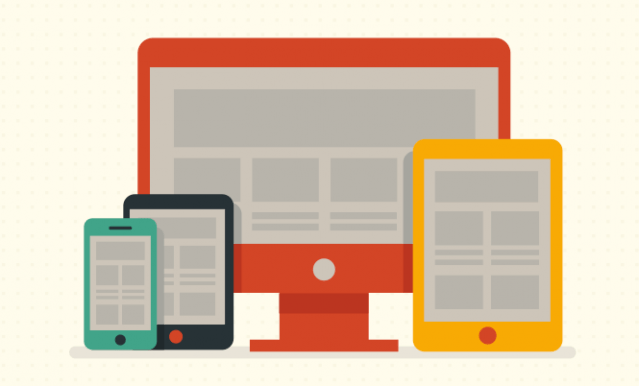
The concept of responsive design was first introduced by Ethan Marcotte in his piece “Responsive Web Design” in A List Apart. The basic idea is to design a website that “responds” to its surroundings. Rather than creating two separate versions of your website – one mobile and one desktop –, you have one version that conforms to the size of whatever device it is being viewed on.
What Does Google Have To Say?
Google does not “officially” support any particular way of designing websites, but their actions continue to encourage the creation of responsive sites. When discussing smartphone sites here, Google states the following:
“We recommend using responsive web design because it has many good aspects:
- Using a single URL for a piece of content makes it easier for your users to interact with, share, and link to your content, and a single URL for the content helps Google’s algorithms assign the indexing properties for the content.
- No redirection is needed for users to get to the device-optimized view, which reduces loading time. Also, user agent-based redirection is error-prone and can degrade your site’s user experience (see “Pitfalls when detecting user agents” section for details).
- It saves resources for both your site and Google’s crawlers. For responsive web design pages, any Googlebot user agents needs to crawl your pages once, as opposed to crawling multiple times with different user agents, to retrieve your content. This improvement in crawling efficiency can indirectly help Google index more of the site’s contents and keep it appropriately fresh.”
More Support From Google
On February 6 of this year, Google announced that it would be rolling out enhanced campaigns in AdWords. The key features for the upgrade include the following:
- Powerful marketing tools for the multi-device world.
- Smarter ads optimized for varying user contexts.
- Advanced reports to measure new conversion types.
In other words, Google will be allowing a single campaign to contain different content for different devices, different user locations, and different times. They are acknowledging the power of mobile usage in advertising, and subtly encouraging agencies to build responsive sites and landing pages. According to Larry Kim, co-founder of WordStream, “This is a really big issue – the biggest change to mobile advertising on Google for the last five years.”
The Benefits of Responsive Design
Besides Google’s unofficial endorsements, responsive design comes with several other perks.
Benefit #1: Improving Overall Usability
Google has mentioned time and again how important the user is to search engines. And, of course they are correct, because without a user, where would the web be? One of the most significant benefits of responsive design is increased usability. On a responsive site, users should easily be able to find content they are in search of, and follow though with the desired action. Because responsive design calls for a single site, rather than a “lite” version of a site for mobile devices, most (or even all) content is available to any user at any time on any device.
Benefit #2: Getting Your Piece of The Pie
According to California-based Net Applications, mobile browser usage has nearly doubled in the last 12 months, and in the past 24 months has more than tripled. These numbers include both smartphones and tablets. In 2014, mobile usage is expected to overtake desktop usage. If you haven’t started to think about how you should handle your mobile audience, the time is now.
Think about it this way- do you have a smartphone? You probably do. How often do you use it? If you’re like me, my personal mobile usage has already overtaken my time behind a desktop. Even if you don’t have a smartphone, all you need to do is look around you the next time you step into a doctor’s office, an elevator, a fast-food line…people are on their smartphones everywhere. These numbers will not be decreasing any time soon.
Benefit #3- Easier and cheaper to manage
While the initial cost of a well-designed responsive site can be significantly more than the standard desktop site, you must understand what you will be saving long-term. Besides the fact that you will most likely be providing a better user experience, possibly gaining more clicks, and potentially increasing conversions, there are savings to be found in future maintenance as well.
Because responsive web design calls for a single site, changes need only be made once. Need to revise an article? Once. Want to change an image? Once. Have to update your staff page? Once. You will essentially be cutting any upcoming maintenance in half in terms of both time and money.
What’s Next?
Now that you’re convinced of the benefits of responsive design, you’re probably wondering how you can make your site responsive.
A Cost-Friendly Alternative
A well executed responsive website can be costly. So what is the small business owner to do? The answer: go responsive, but cut back on the customizations.
As I mentioned earlier, we’ve begun suggesting responsive structures for all potential redesigns. Acknowledging that not every company has the budget for a completely customized, fully-responsive site, we’ve begun offering an alternative. In addition to recommending a customized responsive site, we now allow our clients to choose pre-designed, pre-developed templates from reputable sites like Elegant Themes or Theme Forest.
Why A Template?
While the clients who choose to take the less expensive route do not receive a site with features customized to their specific business, they still receive the benefits of a responsive site. Because there are several sites with well-designed responsive premium templates, it is relatively easy to choose a theme that fits our client’s needs.
A template has the potential to reduce the cost of a responsive site by more than 50%. Because the design is already selected, there is no back-and-forth about changes, because the site is already coded, there is no need to debug. The majority of the budget in these template cases goes to setting up the WordPress, reorganizing content properly, and adding small-scale customizations (company logos, branding colors, etc.).
How To Offer A Template
When suggesting a template theme to a potential client, it is important to be completely transparent. Don’t attempt to sell them a pre-made theme and charge them the price of a fully customized site. You need to be honest, not only because it is the right thing to do, but also because it will be much easier on yourself and your client in the long run. If your client understands that they will be choosing a template, they can be of great assistance during the process. They can choose the theme, and you can build it for them. They will understand that what they see is what they get. You won’t need to fight them later about design changes or customizations.
Our Own Responsive Site is On the Way!
You may be wondering where Optimum7’s responsive web site is? Well, to be honest, I keep pushing it to the side to work on client-based projects. However, the time to begin thinking responsively is now, and in the very near future, I will be taking my own advice and creating a responsive site specifically for Optimum7. Stay tuned for details on that!
Does your site have the power to handle mobile usage increases? Contact us today for a free quote on how to make your site responsive!