 In my last post, I discussed the differences between artists and designers. After posting the article, I received the following comment from Katherine:
“Very interesting concept here. It’s been my experience that designers tend to think of themselves as “artists” and self-apply the label. I think that has more to do with the myth you described than 1950s advertising agencies. For instance, how many designers refer to themselves as “creatives”? That title sounds more fit for an easel than a marketer.”
This comment got me thinking, “how much of what I do involves creativity?”
The answer: quite a bit.
However I think the label “creative” has two connotations. The first is a somewhat self-applied label used by designers, copywriter, marketers, etc. In my opinion, it is worn more as a fashion statement than an actual job description. I feel that sometimes people are fooled by shows like “Mad Men” or the reality series, “The Pitch,” which glorify the glamour of ad executives and agencies. In reality, most real marketing firms do not resemble shows like this. As a whole, I’d say we are hard working people, with relatively scandal-less lives, just like everyone else.
The second meaning of the title “creative,” is one that I hold much closer to what I actually do. Take a look at the tweet below from 99U, a site that focuses on “delivering the action-oriented education that you didn’t get in school, highlighting real-world best practices for making ideas happen.”
Creativity is caring enough to keep thinking about something until you find the simplest way to do it. – Tim Cook bloom.bg/TN0BA8
— 99U (@99u) December 8, 2012
I honestly can’t think of a better way to describe creativity, or to describe what I do as a designer. This is exactly how I feel about design. We, as designers, research and sketch and mockup and create digital comps until we break down the problem to its simplest, most elegant solution.
Let’s review some real life examples to describe what I mean…
Logo Design
I’ve written somewhat extensively on the perils of logo design in the past, so I feel it only appropriate to begin our creative search here. Logo design is especially difficult because designers typically need to fit an entire company’s core value, or even several core values into a single, memorable image.
To do this, and do it well, you need to use creativity. Here are a few examples of beautiful, well-designed, simple logos that started out as a bit of a mess.
Wendy’s – 1983

Wendy’s – 2013-Present

Clean lines, simplified branding, a redrawn face, and less text make up the new design for the Wendy’s logo. The new Wendy is cheerful, innocent, and patriotic, without detouring too much from the original Wendy, modeled after owner Dave Thomas’ own daughter. In addition, the logo has been stripped of the slogan “quality is our recipe,” and the subtext, “old fashioned hamburgers.” While a lesser-known brand may not be able to pull this off, it is a wise decision in this case. Wendy’s is well known enough by consumers to stand by the brand name alone. Also, Wendy’s now serves much more then hamburgers, and the reference to “old fashioned” may not necessarily be a desirable feature anymore.
Starbucks – 1971

Starbucks – 2011-Present

As you can see, the original logo was meant to mimic the wood cut illustration of a Greek siren. The original logo was topless, with a fully visible double fish tail. In the new logo, the illustration becomes much more stylized and simplified. When we move to a close up, rather than a full view of the siren’s body, we move the focus to her face and crown. In addition, the close-up makes the logo more memorable and relatable. Finally, we see the loss of the “Starbucks Coffee” label. Similar to Wendy’s, Starbucks is much more than a coffee company today. They sell tea and bistro-style snacks and meals now, as well.
Toys R Us – 1969

Toys R Us – 2007-Present

Although the change here may seem subtle, there is much more at play here than the new placement of the star. The original logo placed quotation marks on the backwards R. In reality, there is no need for these marks. It is not an imaginary R, it’s simply an R meant to mimic a child’s backward writing. In addition, the old logo was somewhat unbalanced with the star around the letter R. The new logo places the star within the negative space of the R, making for a simplified, striking effect. The typeface has changed slightly in this logo as well. Take a look at the O for example. The counter (negative space within the O) seems to be looking down. Consider this: If this logo is supposed to represent a fun, adolescent feel, does an O glaring down from above fit the bill? I think not. The new O seems to be looking up at the T, like a small child looking to a guiding parent. Finally, the colors have changed as well. Toys R Us replaced the original color scheme of red, green, and dark blue with a much brighter, engaging pink and lime green.
What’s the big idea?
Although each of these logo redesigns seem to demonstrate only subtle changes, the overall look and feel is impacted greatly. It is through thorough research, creativity, and problem-solving skills that these designs were made possible.
Let’s take a look at a two examples of creative elements on websites and apps as well…
Mashable

Late last year, Mashable made the switch to responsive design. Understanding the need for visibility across all platforms, they sought to design a site that would give their users excellent user experience and accessibility.
Although a responsive redesign is not exactly groundbreaking at this point, there is a truly creative feature I’d like to point out here, which I’d never seen before.
Show As List, Show As Gallery
This feature is used when a large group of photos are listed within the same post. These photos are grouped and load as a slideshow. However, you have this little gem right here.

Thank you! I don’t know whose idea this feature was, but seriously, thank you. I cannot tell you how annoying it is to be forced to load and view images as slideshows on my desktop, never mind on my phone. As we’ve discovered in recent years, users generally prefer scrolling a long page, then loading several pages or images separately, one at a time. I’m not quite sure what the infamous Grumpy Cat is frowning about here, but personally this feature makes me smile from ear to ear.
However, if you prefer to see the images as the default slideshow, Mashable has created a simple solution for that as well with its “Show as Gallery” function (see below).

*Note: I won’t pretend that I’ve seen every site on the Internet, if there are great features like this on other sites, feel free to share them in the comments below.
ZocDoc
Truth be told, I originally heard about ZocDoc from my boss, by way of a Facebook ad. (Which just goes to show the power of social media, but that’s another topic for another day.) ZocDoc is an app created by a New York startup that allows patients to easily schedule doctor’s appointments online. ZocDoc won the Silver Prize for Most Useful Consumer Health Care Service at the UX 2013 Awards.
What makes ZocDoc so special is its intuitive booking functionality. Let’s check out their homepage.
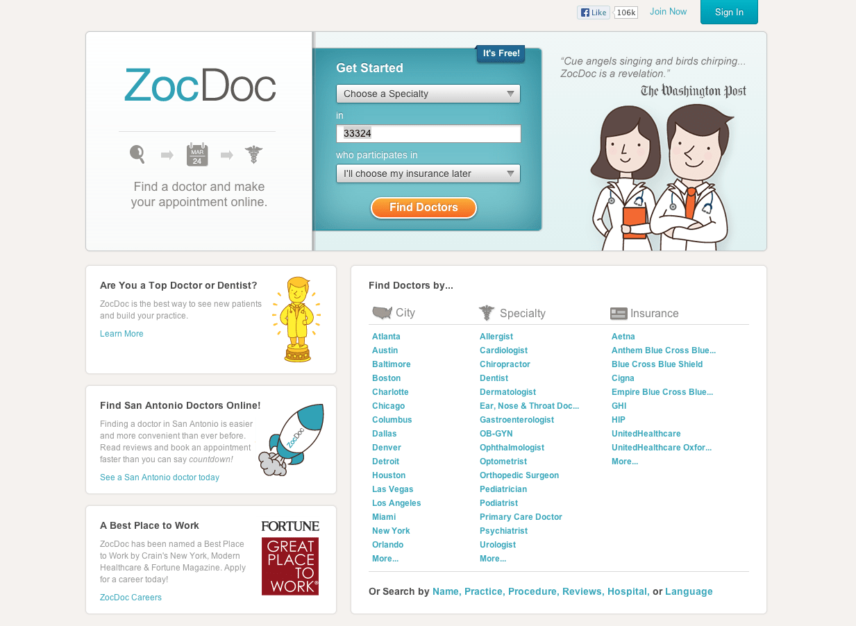
The first step is to choose the type of doctor you are looking for. This system includes everything from dentists, dermatologists, and cardiologists to acupuncturists and infections disease specialists. You then type in your zip code to find doctors near your desired location. As a third, optional step, you can limit the search to doctors who only take your insurance coverage. In this example, I’ve chosen to look for a dermatologist near Optimum7’s Miami office, and decided to leave my insurance information for later. These options will take you to a page that looks like this:
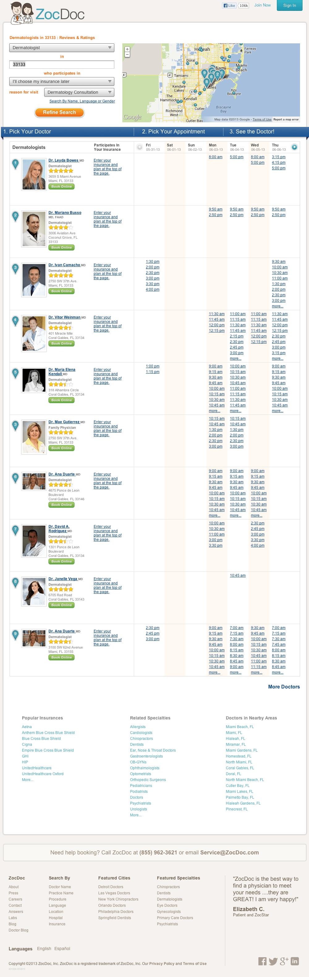
On this page, you can see a complete list of the doctors in your area within the desired specialty. Each doctor has a headshot, full name, specialty, location and rating. If you click on a doctor, it displays a full profile. What’s even better, each doctor has a list of open appointment times to choose from. Let’s say we’d like to see the first doctor for an appointment on this coming Tuesday. Simply click the available date and time, and you’ll be brought to this page:
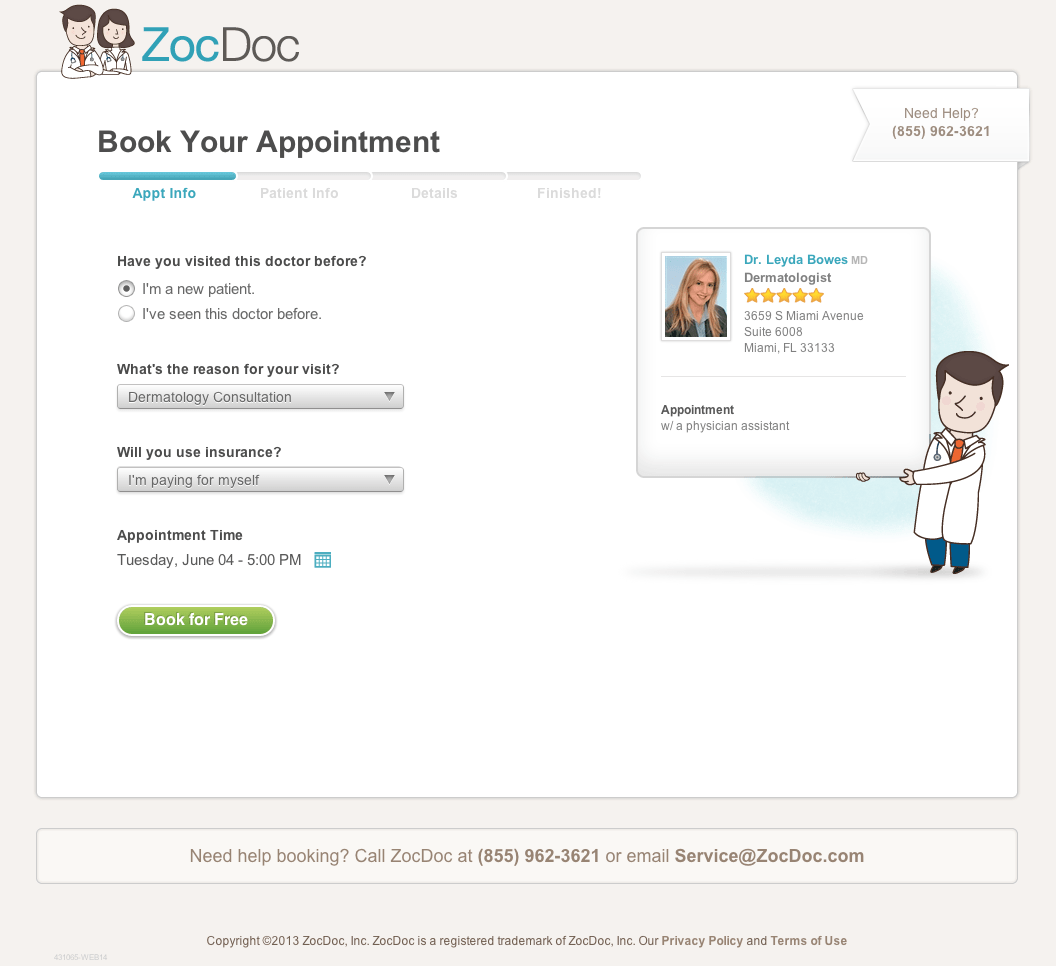
Here, you are asked to fill in basic information that you’d normally answer over the phone when scheduling an appointment. You then follow the simple onscreen instructions to create a ZocDoc account (or to login if you already have one) until the appointment is scheduled.
The Takeaway
Whether sipping a fresh cup of coffee, scrolling through a news site for an interesting story to tweet, or scheduling a doctor’s appointment, creativity in design is all around us. Every day, designers find solutions to everyday problems that may sometimes seem unsolvable. And what’s more- they do it in a way that makes the entire experience enjoyable.
Perhaps it’s because I am a designer, and I notice little, thoughtful features in websites and apps that make me squeal with delight. But when I visit the Mashable site, and see that “show as list” feature, or schedule an appointment through ZocDoc, I feel a rush of relief. I don’t have to load page after page. The processes are simple and fun. I actually find myself getting lost on the Mashable site all the time- that’s how easy it is to use. What can we learn from this? Make your sites enjoyable. Make them easy to use. Make it difficult for your users to leave, and they won’t.
Are you looking for a designer who isn’t afraid to think creatively? Contact Optimum7 today!