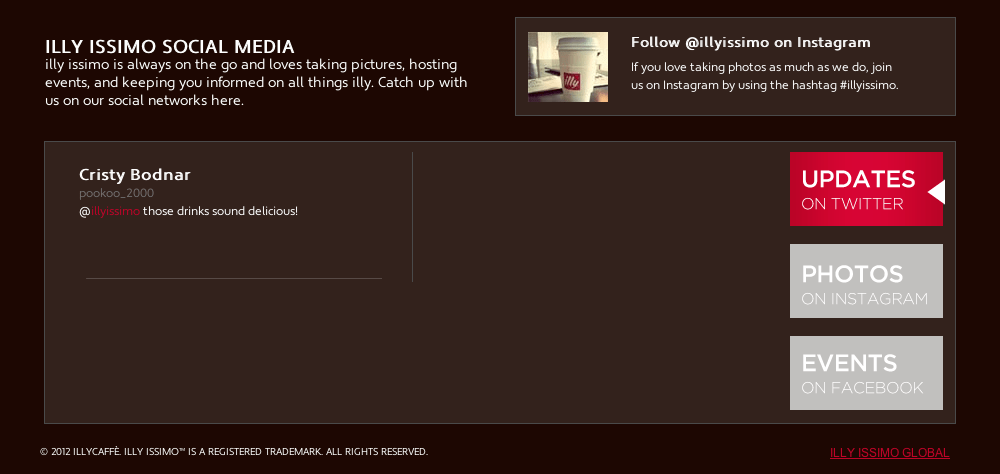
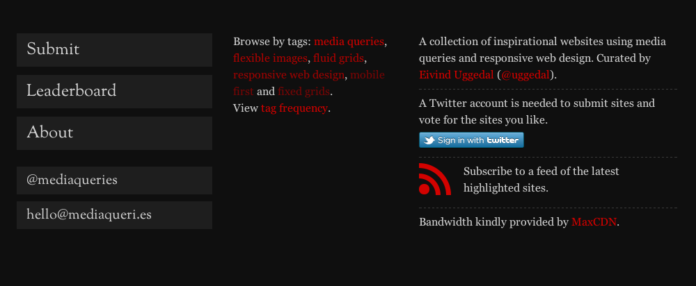
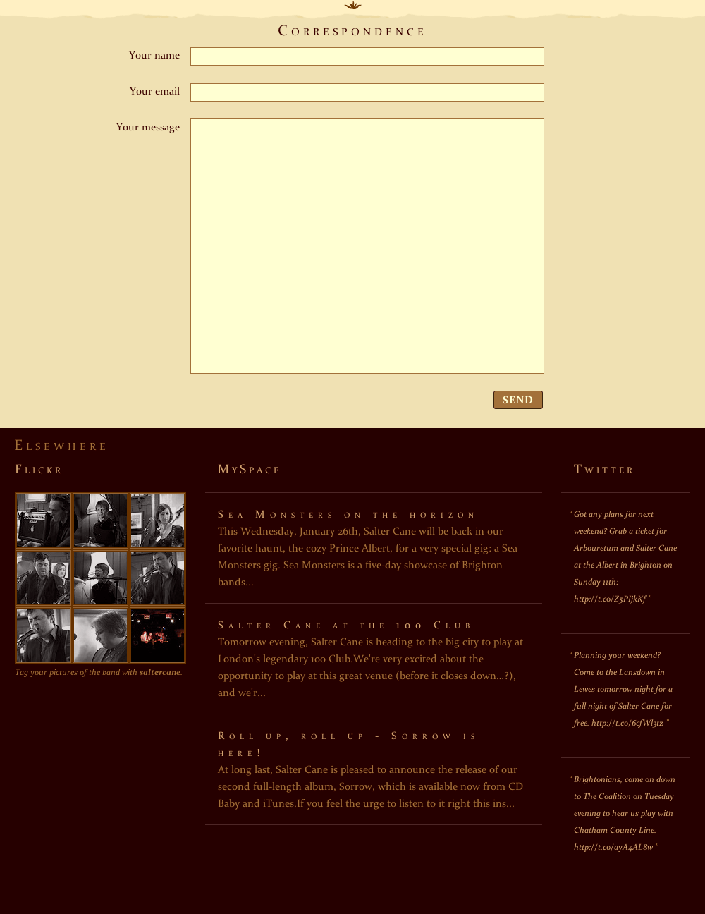
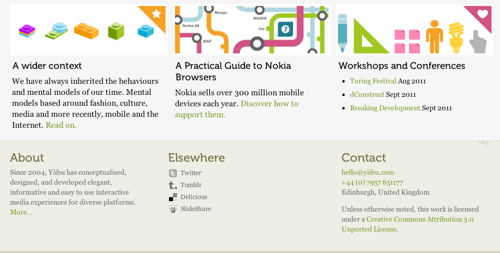
 This week, our Senior Developer, Julian Beaujardin, and myself, launched the newest improvement to the Optimum7 website. Since I am especially obsessed with how the change has come out, I decided to devote this week’s entire article on it. This week, we have traded in our old, squat footer for a tall, dark and handsome one!
Now, I know what you’re thinking: “Bridget, please, an entire article about footers? No way!” Yes way! In this article, I will discuss why tall footers will become a staple in web design, explain the justification process of the Optimum7 footer design, and provide ten examples of fabulous footers to inspire you!
Footers of Yesterday and Today
For years, the footer was considered the redheaded stepchild of the website layout. Designers (present company included, admittedly) would haphazardly complete their sites with a copyright and maybe a horizontal sitemap listing the main pages of the site. This is partly because of the notion of the website “fold”. As I briefly discussed in a recent article A-Z Guide to Web Design, the “above the fold” notion behind designing sites is becoming more and more irrelevant as the days go by. In the early days of the Internet, designers placed as much vital information at the top of the page as possible. This is because many home computers and connections could not handle loading an entire page, and if they could, it took a very long time. In these situations, putting the most important information- the logo, a phone number, a call to action- in the header made perfect sense. Most designers didn’t bother with a fancy footer, because often they would go unnoticed. Well, thanks to the wonderful high-speed Internet of today, this is not as pertinent an issue as it once was. Designers can create beautiful sites from top to bottom that load in milliseconds. Hence, the age of the supersized footer.
My, What a Tall Footer You Have
Now, I’m not suggesting that designers have adapted many sites to include a tall footer simply because they can. That would be silly. On the contrary, I’m suggesting that we’ve done this to take advantage of the valuable real estate at the bottom of our pages.
As usual, I ask you to put yourself in the user’s position. On the Optimum7 website, we are constantly publishing fantastic, useful content (like the article you are reading right now, for example!). It is likely that our users will read the content in its entirety, or at the very least, quickly scroll through to find the information they are searching for. When you are finished reading, where are you? At the footer! Isn’t it more user-friendly to simply click on a link in the footer, then to scroll all the way back to the top of the site to continue to the next step. Of course it is. By including a large footer in your site, you are making it easier for the user to continue browsing your site. By doing this, you have a better chance at improving your bounce rate, keeping users on your site, and ultimately obtaining more conversions.
Alright, I’m Convinced, Now What?
Ah, welcome to the dark side, my friend. Now that you are convinced that a tall footer will be a great mini-revamp to your site, the next step is to analyze and define which content to add. Keep in mind that the information you add will vary based on what steps you want your users to take when they reach the bottom of the page.
Depending on your specific area of expertise and what action you’d like your user to take, you could choose from any of the following ideas:
- Links to social media outlets
- A showcase of illustration or special artistic ability
- A secondary call to action
- Recent posts
- A newsletter signup form
- Staff spotlight
- Address
- Phone number
- Contact form
This is actually a very abbreviated list. The possibilities are truly endless. The best aspect of a tall footer is that you have plenty of room to mix and match.
Optimum7: A Mega Footer, A Mini Case Study
Let’s first go back in time, way back to last week, and look into Optimum7’s previous footer.
While this footer did serve its purpose for a long time, it was definitely time for a revamp. The main issues here were readability and user-friendliness. The font-size of the links were too small, making them nearly illegible. In addition, because their was no visual hierarchy among the links, nothing stands out and truly says “click me!”
While all the links provided were useful, it was unlikely that the average user would take the time to scan through each link to find what they want.
Enter our new footers. Yes, “footers” as in plural. When redesigning the footer, we decided that users who land on the homepage and users who land in our articles section most likely have different wants and needs when they reach the bottom of the page. These needs should be addressed as such.
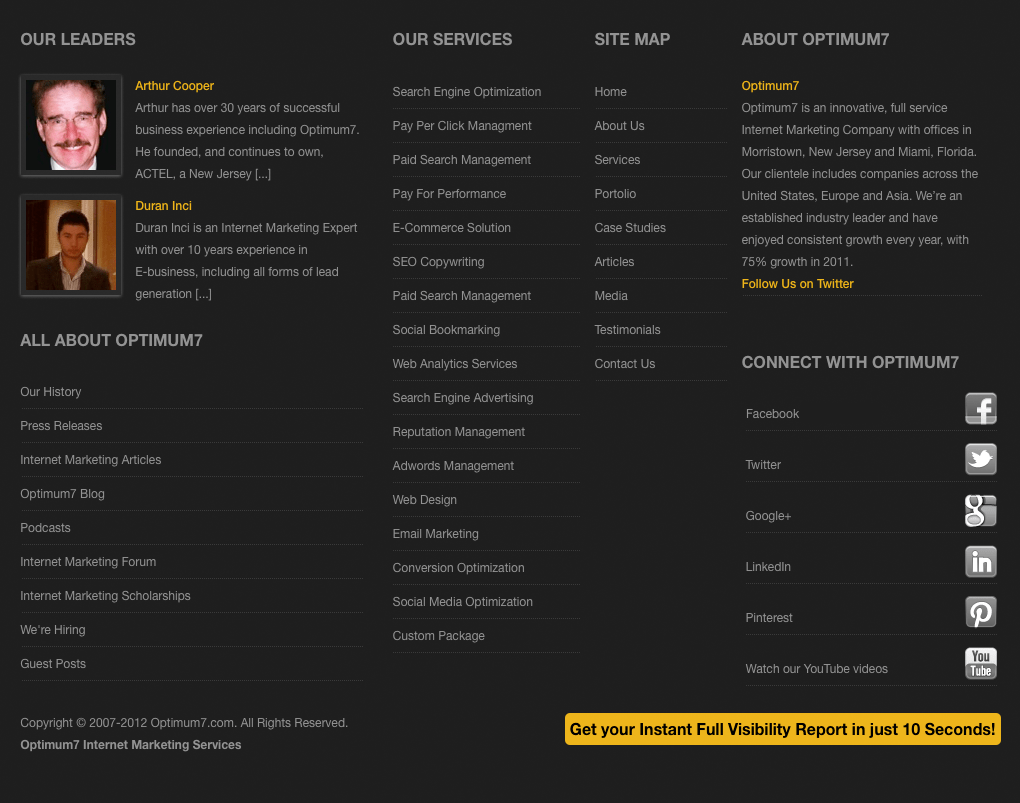
Let’s first take a look at the footer on our home page:
“Whoa, Bridget! That’s a lot of information for a footer!” Yes, friends, it is a lot of information. But, here at Optimum7, we have a lot to say!
The challenge here was to provide just as much useful, relevant information that the old footer offered, but in a way that was easy for the user to digest. In design, the easiest way to do this is to use a grid. By using four distinct columns with clear headers separating each section, we have done just that.
For the home page, we broke down the needs of the user into 7 basic categories:
- Users who want to learn more about the leaders at Optimum7
- Users who are interested in learning more about Optimum7 in general
- Users who are interested in Optimum7’s services
- Users interested in Optimum7’s social media
- Users interested in becoming a part of Optimum7’s team
- Users who simply want to learn more about internet marketing as a general subject
- Users who don’t really know what they want
For the first category, we provided an “OUR LEADERS” section showcasing our CEO, Arthur Cooper, and COO, Duran Inci, complete with excerpts from, and links to their full bios, as well as a headshot.
The second section, ALL ABOUT OPTIMUM7, provides information relevant to categories 2, 5, and 6. Each link provides a very short, clear description to its destination.
Below this section, we have included a copyright and our brand name again. This reinforces the header, and provides balance to the footer.
The OUR SERVICES section is very clearly for prospective clients, falling into category 3. In this section is a list of each service we provide, linking to a page that explains that service in greater depth.
The SITE MAP section includes the standard list of all the main pages within the site. We placed this in the thinnest column, because the emphasis should not truly be on these pages. While it is important that users have the ability to travel through these main pages with ease, they are not the most important pages on the site.
The ABOUT OPTIMUM7 section caters to the users in category 2 and category 7. In this section, we offer a brief history about our company with links to the About Us page, and back to the homepage.
The CONNECT WITH OPTIMUM7 section allows users to stay up to date with Optimum7’s social media outlets, fulfilling the 4th category.
Finally, the call to action: “Get your Instant Full Visibility Report in just 10 Seconds!” allows users to interact with our new offer- a completely free, completely instant visibility report of your online presence. This call to action is useful for each user category listed above, and is one of the most important links on any page of our site. So, it is only fitting that it be repeated at the end of each page.
Next, the footer designed especially for our articles section:
You will notice that this footer is almost identical to that of the previous example. In fact, there are only two differences. Those differences are the RECENT NEWS section on the left and the OUR TEAM section on the right.
As I mentioned before, people often stumble upon our articles section for a different reason then when they stumble upon our main site. Usually, they are looking for an answer to a question. We have created a separate category just for these users: Category 8: Users who are reading articles in search of important information. While you might argue that anyone on the Internet is in search of important information, we are catering to Category 8 for one reason. This reason is what I like to call the “Addictive-Internet Effect”.
What is the Addictive-Internet Effect?
Allow me to quickly add a disclaimer to this article: the “Addictive-Internet Effect” is not a technical term, it is not a highly tested effect, and you cannot catch it in public restrooms. This is something that I have come to know through personal experience, and most likely, so have you.
Consider this situation: It’s a lazy Saturday afternoon, and you are relaxing in the comfort of your own home. Suddenly, the delicious late lunch that you have prepared- a homemade calzone, for example- has somehow leaked onto your brand new cashmere sweater. You suddenly have a need to research out to remove such a stain. You reach for your favorite search engine, and scroll through the results until you reach a site that harbors the necessary information. While on this site, you notice that there is a link to a nearby dry-cleaner, so you click the link. On that site, you see an advertisement for a sale at your favorite clothing store, and you click this link. On that site, you see there is a blog full of fun outfits for fall. You click again. Before you know it, its 2am on Saturday morning and you still have spaghetti sauce on your sweater. You my friends, have just experienced, the Addictive-Internet Effect.
The point of this fun little anecdote is that once you find the information you are looking for, you become comfortable on a site, and begin to browse around and can very quickly be distracted by interesting, relevant content. Well, instead of providing some type of advertisement, we are offering three recent articles, complete with a photo, an excerpt and a link to peak the user’s interest.
In addition, we have also provided a section on the right side of the footer, to allow users to more easily connect with Optimum7’s most important resources: our staff. Again, we place a headshot, a small excerpt, a link to their full bio, and a link to send a direct email. This can help to increase user engagement.
Some More Non-Optimum7 Examples
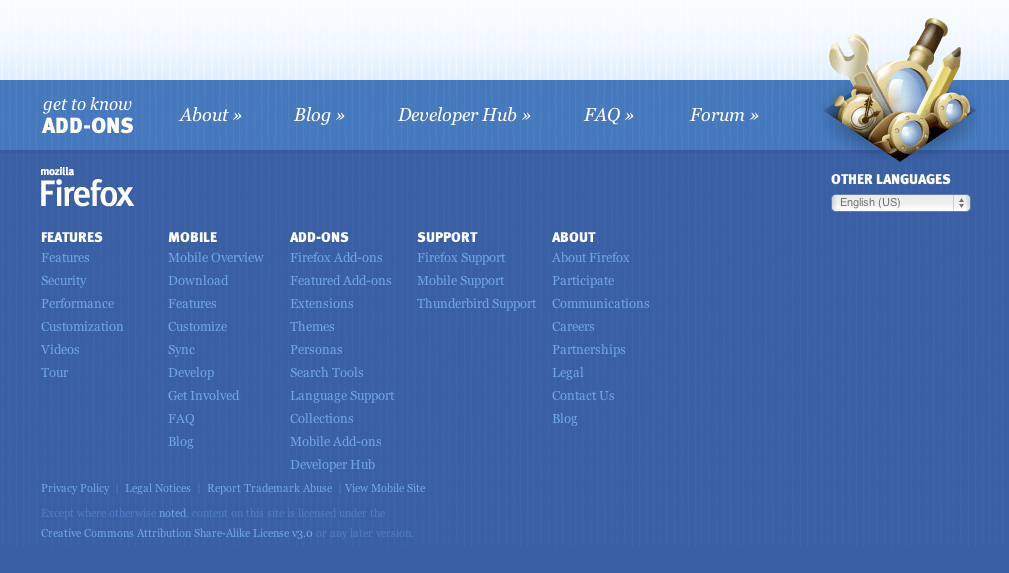
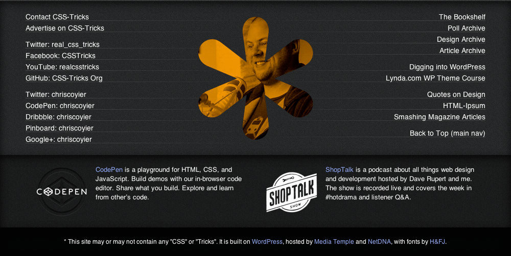
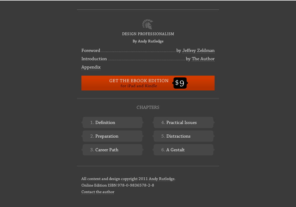
Now that you are as hooked on tall footers as I am, I’d like to provide you with some inspiration that will assist you in the revamp of your own footer! As you peruse through the footers below, you will see that tall footers come in all shapes, sizes, textures, colors, and types. Happy scrolling!
Does your site have a tall footer? Be sure to post links in the comments section as resources for future readers!
