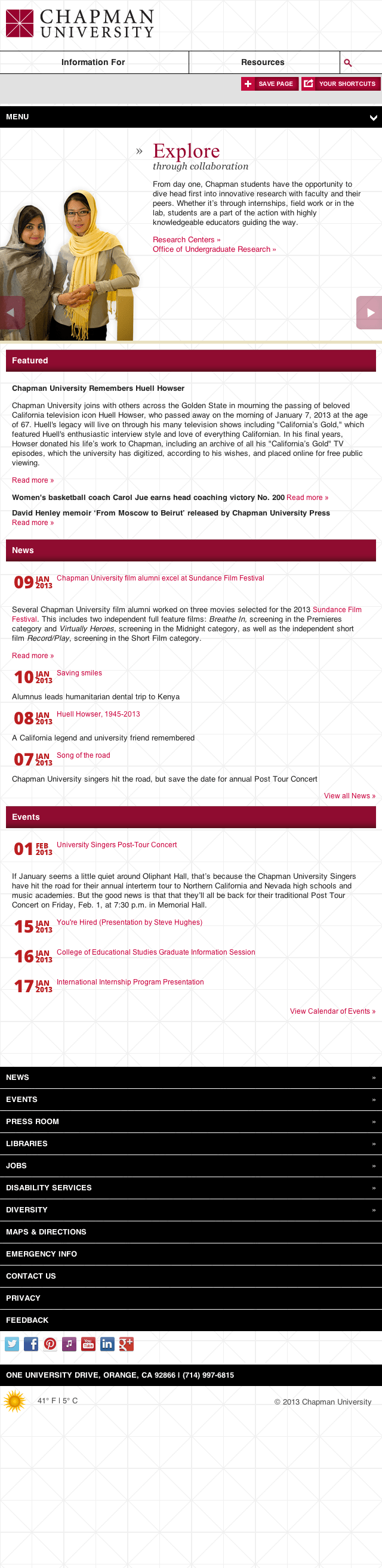
 University of Alabama may have crushed Notre Dame on the field on Monday night at our very own Sun-Life Stadium, but the Fighting Irish definitely seem to be winning from a technology and web design standpoint.
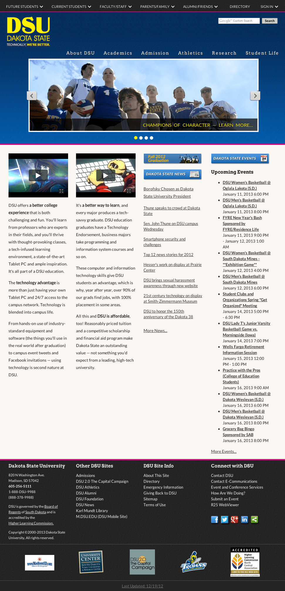
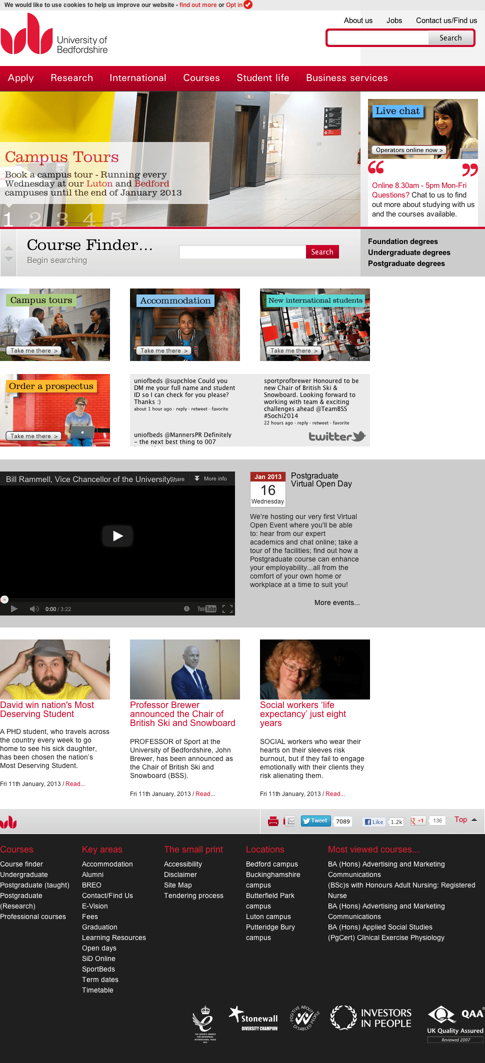
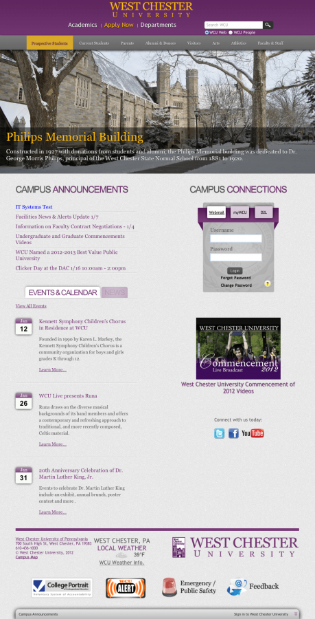
Being the nerd that I am, I decided to check out both websites on my phone, ua.edu and nd.edu during the commercial breaks of the championship game. I visited the University of Alabama site first, for no particular reason, and was met with- well, pretty much what I expected- a standard mobile site. It was okay. I could easily navigate through the pages and back, but the low-resolution icons on the homepage did make me a little crazy.
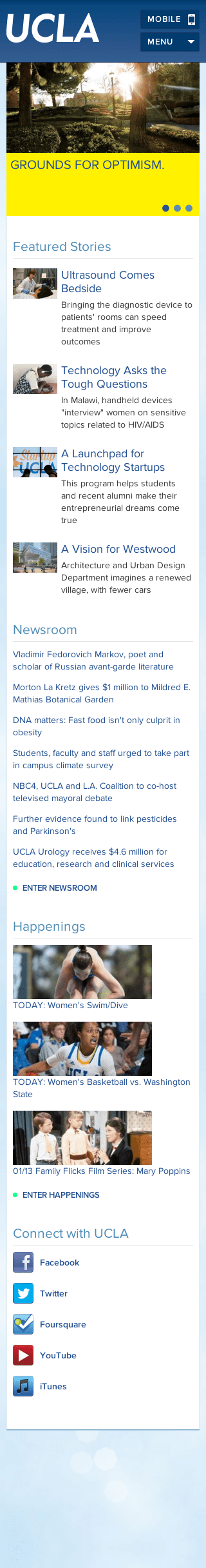
Next I visited Notre Dame’s site. To say that I was pleasantly surprised with the site is an understatement. Intrigued, I abandoned the game and rushed to the nearest desktop to investigate further. My suspicions had been correct. The site was responsive. But it wasn’t just responsive, it flowed beautifully from large to small and back again. Truly well-designed at first glance. The more I inspected the site, the more interested I became.
Now, let me tell you: as a devout University of Miami fan, this is a very, very high compliment. In fact, the Notre Dame site inspired me so much that I decided to devote this week’s post to praising and critiquing nd.edu and its responsive strategy. So, my fellow Canes fans, now is the time to scream and yell at me for my Benedict Arnold-like behavior. You may want to read another article on this site, or leave your computer completely to sulk in a corner. Or, you just might want to have an open mind, and travel with me on this responsive journey.
Why Should Universities Look Into Responsive Websites?
According to the Pew Research Center’s Internet & American Life Project, in February 2012, 67% of adults aged 18 to 24 own a Smartphone. This was an increase of 18% in less than a year. This same age group makes up the vast majority of undergraduate students in the United States. What does this tell us? It tells us that the majority of the target audience (adults between the ages of 18 to 24) owns a Smartphone, and is using it more efficiently than any other age group.
It really isn’t all that surprising. I have friends with children under the age of two that understand how to swipe their fingers across an iPhone to change the pictures in a photo gallery. Sooner, rather than later, these two-year-old Smartphone aficionados will be heading off to college, and chances are they will have done their research on a Smartphone or tablet, not a desktop. The question is, will universities be able to keep up with the technological advances?
Universities are meant to be institutions that encourage the pursuit of higher learning. Today, more than ever, information is accessible. A responsive site gives access to more of a web site via mobile than a lighter, separate mobile site. Why wouldn’t prospective students with a thirst for knowledge want the maximum amount of accessibility?
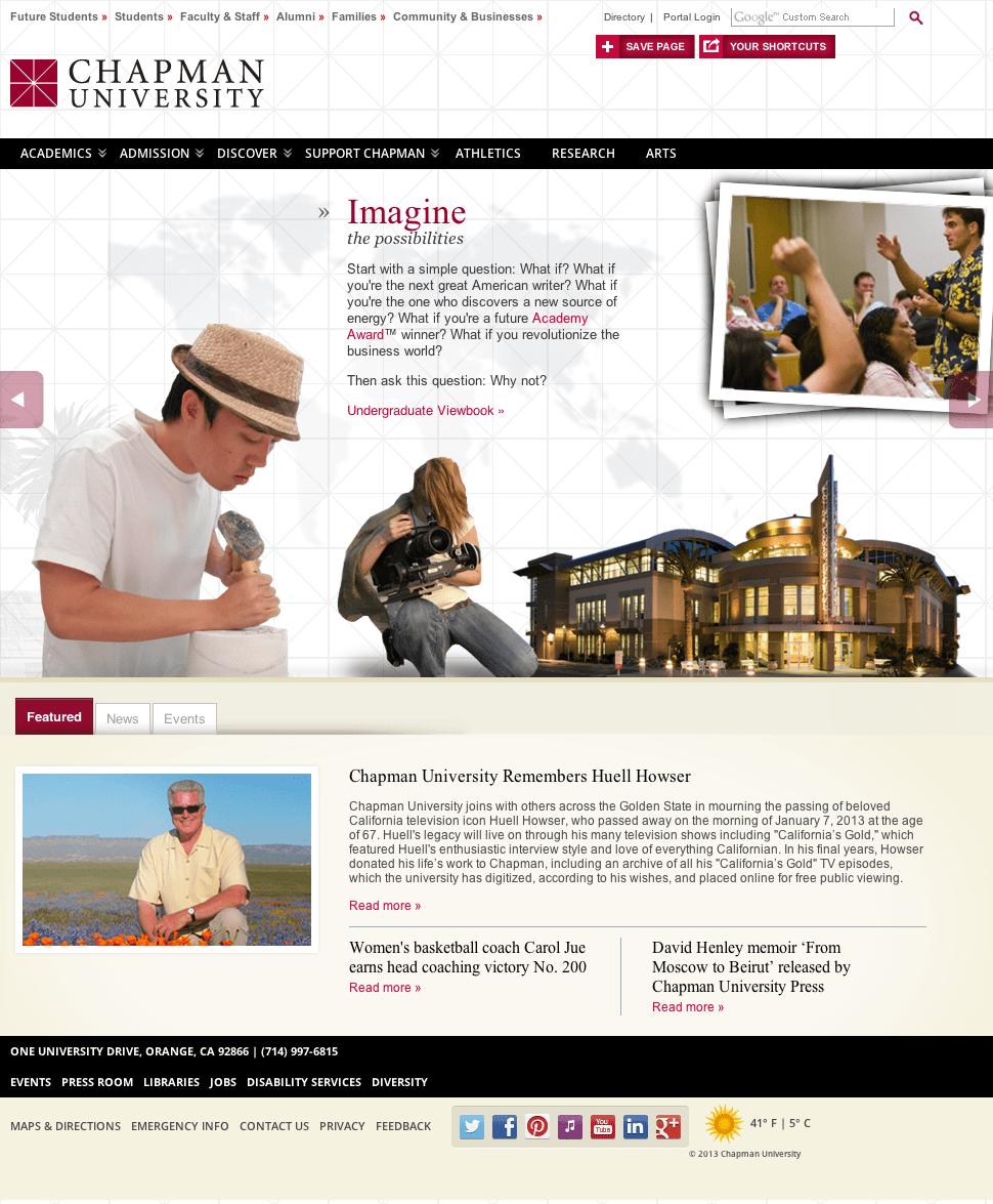
Critique from a Mobile Standpoint

Let’s begin with the positive side of things. The page loads quickly, and I appreciate the high-resolution images in the mobile-friendly banner. In the banner, each photo links to a corresponding video. Incorporating different types of media on the site is a nice touch.
In addition, the main navigation (About, Academics, Admissions, Faith & Service) all fit within the screen upon page load without the need to scroll. However, on the desktop site, when clicking on one of these options the page scrolls to the corresponding section. On the mobile site, a new page loads. I don’t think this strategy on the mobile site is as user-friendly, as users have to wait for a new page to load.
My favorite aspect of the mobile homepage is the secondary navigation (Menu, Mobile, and Search).
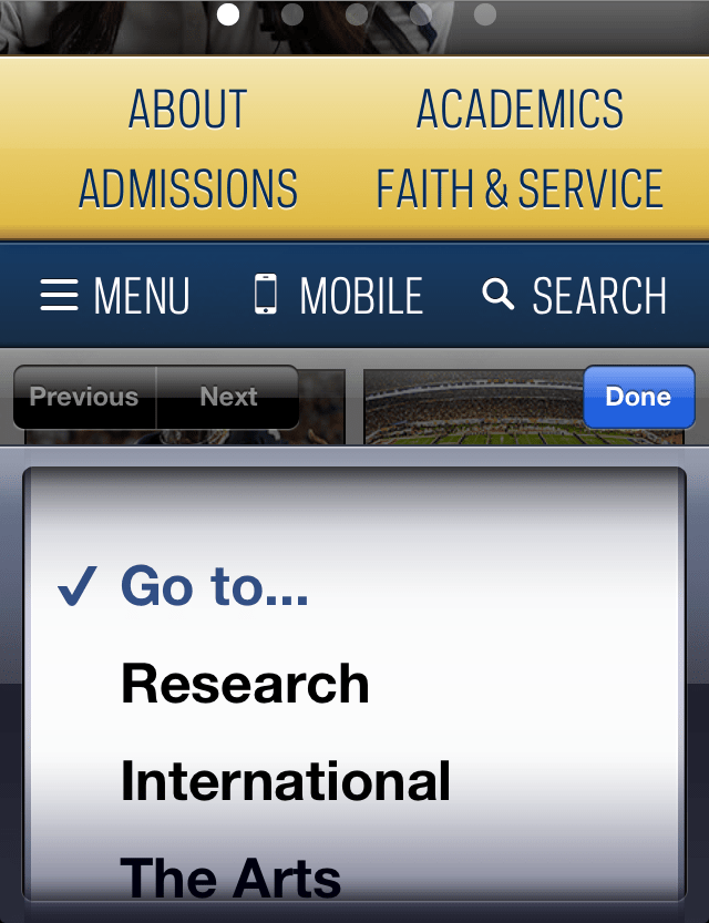

Firstly, the “Menu” opens as a dropdown menu, rather than loading an entirely new page. By cutting out a step, users are likely to find what they are looking for more quickly. The “Search” also opens within the same page, but hides when you don’t need it. In my opinion, this is a great principle for usability- it’s there when you need it, not when you don’t. Finally, the “Mobile” option sends users back to the standard Notre Dame mobile site: m.nd.edu. This not only gives the users the option of the full site or mobile site, but it also allows Notre Dame to track how successful the responsive strategy is for users. If the data suggests that most people are continuing to the separate mobile site, they may need to rethink the concept. I, for one, would be very interested in seeing this data. I have often seen mobile sites with the “Go to Full Site” option but not the other way around.
Next we have two images and two headlines with Notre Dame current events. The images, once again, are high resolution and the news is actually current. I can’t tell you how many times I have seen a “Latest News” section on a site that hasn’t been updated in over a year. Keeping up with a current events section suggests attention to detail and care, two aspects that are very important to users who may be looking to buy.
I was surprised by the “Tour Locations” button, as it also opens in the same page. Once again, it’s there when you need it but not when you don’t.
The social buttons near the footer are nice, clean and clear, but I would suggest perhaps opening in a new tab rather than in the parent window.
The text links at the bottom are okay; my only issue is the “ND Alert” link. I am wondering if it becomes more prominent if there is an alert. If not, that could definitely be an idea to consider.
One drawback to this Notre Dame mobile view is that no navigation is visible upon page load in this position. Although scrolling has become second nature, if a user is searching for the nd.edu site, it is likely that the address or search was typed. And research shows that users prefer to use their smart phones in landscape position when typing as it yields wider characters on the keyboard. Thus they would very possibly land on this page in landscape, rather than portrait.
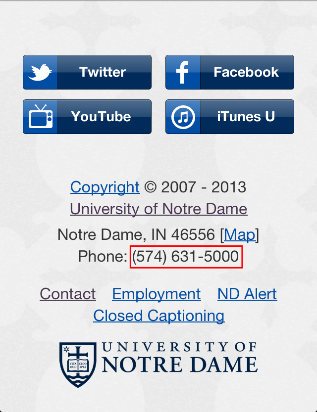
Finally, my biggest issue with the mobile view- and one I can hardly believe was overlooked after such attention to detail on the rest of the site- is the phone number at the bottom of the page. It isn’t click-to-call. That means, if you want to call the number listed, you need to either remember it, or you need to write it down somewhere and then type it into your phone.
Critique from a Desktop Standpoint
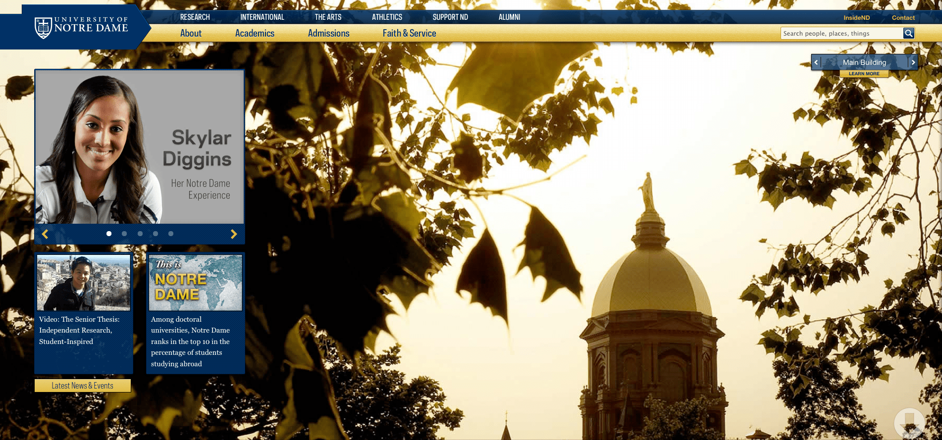
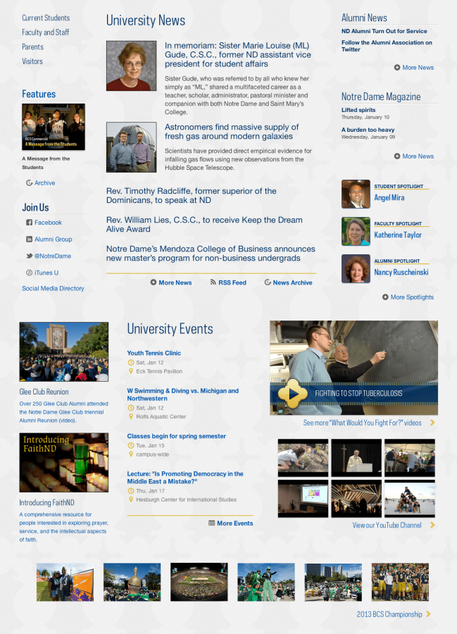
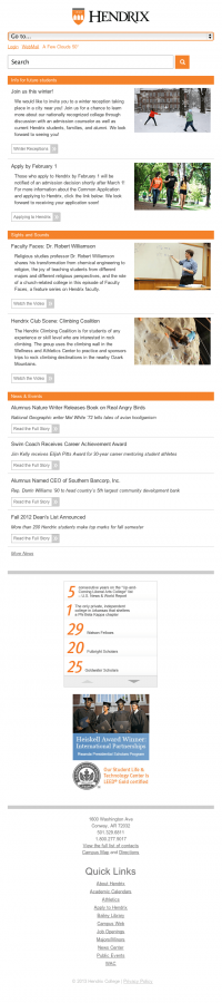
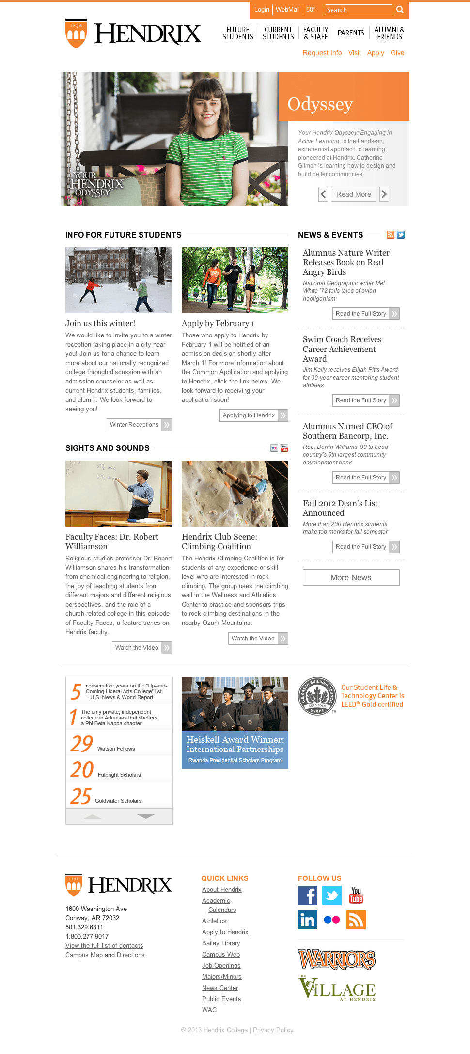
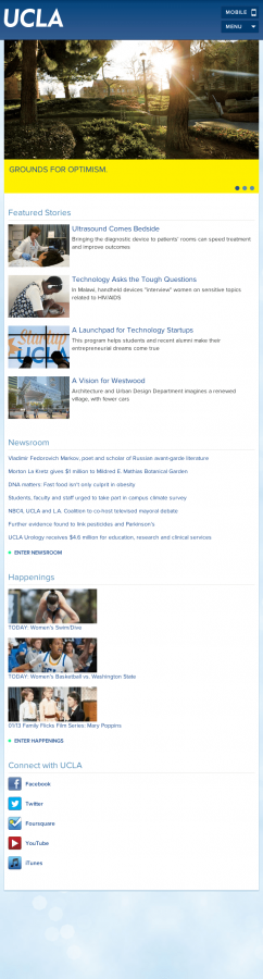
Upon landing on the desktop site, I am met with a large background image of the beautiful Notre Dame landscape. Again, a high-resolution image makes for a stunning display. Also, I’d like to mention that the angle of the statue pictured on the homepage. Rather than using a photo of a statue facing the user, the statue is in profile and facing the left side of the page. This directs the users’ eyes to the main navigation, the banner, and the “meat” of the site. On the right side of the page, there is an option to slide the background image from building to building. This is a very nice feature- great interaction with the site but not overwhelming for the user. And, once again, each photo directs the users’ eye to the left side. My personal favorite is the photo of Notre Dame Stadium (below), where the fans depicted are actually pointing to the left. Subtle, but not.

As we continue down the page, the navigation stays at the top of the screen but leaves an empty margin between the top of the navigation and the top of the page. This is a nice effect that allows the page to truly breathe.
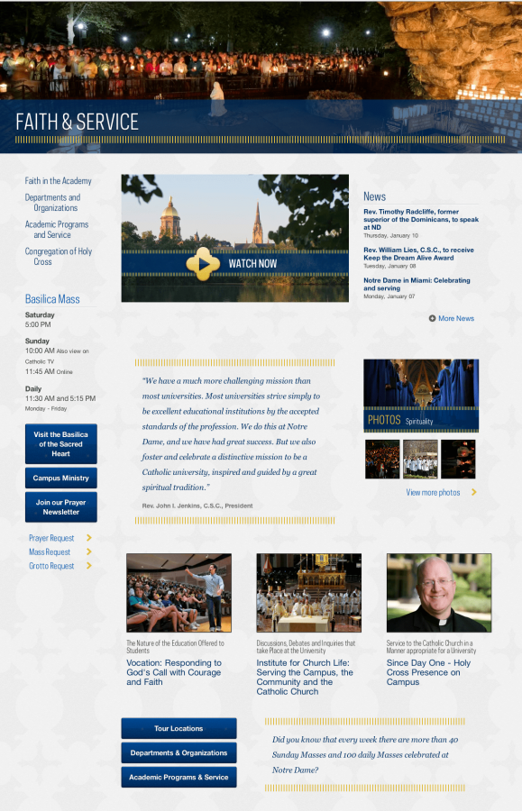
Okay now, I know that I have been praising the Notre Dame online effort for the majority of the article. So here is my harshest critique. When I continue to scroll down, the three-column layout loses me. It is clean, and the headlines do standout. It is clear what is a link and what is not. But I am confused as to where to click. It seems that there is quite a bit going on. Now it could be argued that users who approach this site may be looking for something specific, and that they would not have a problem navigating to where they need to go. But from a standpoint of someone who just wants to peruse the site, it is a bit overwhelming. I think that a two-column layout would be a bit easier to digest, or some vertical lines (or another visual feature) could break up the columns into clearer sections.
For example, I think that the “Colleges and Schools” section is very well done. It is easy to identify which school is which, and learn more about each school. Although there are 4 columns in that section, the boxes make it much easier for the user to understand.
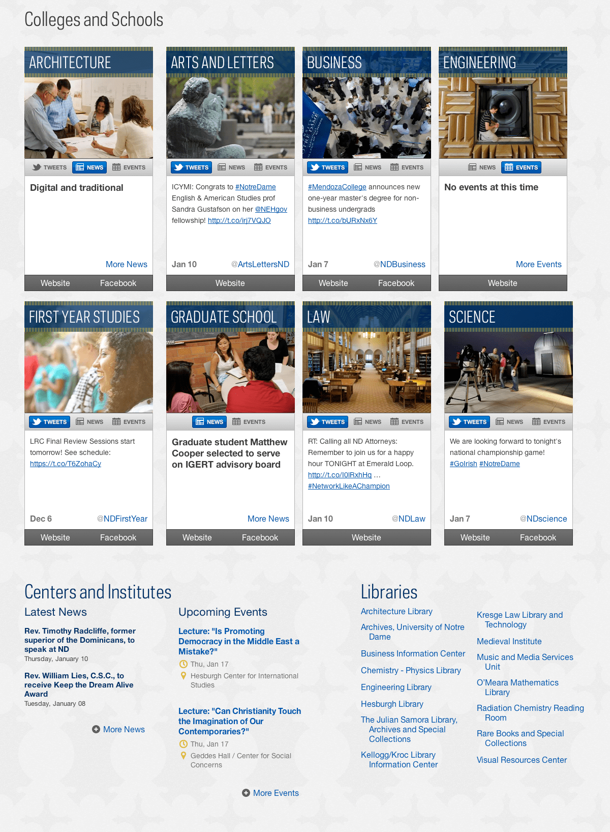
My final critique for the Notre Dame desktop view is in reference to typography. As I mentioned before, I think that some of the sections (“University News” and “Faith and Service”, for example) are a bit busy. I think that this may also have something to do with the typographic choices made. The mix of Galaxie Polaris Condensed Book, Helvetica Neue, bold, normal-weight, and differing shades of blue are contributing to the somewhat disorganized feeling of the page. I think that the typefaces are a bit too similar to be cohesive in this layout. On this occasion, less probably would have been more. I would have suggested one typeface of different weights and sizes, with all links in a single color, and all body text in a single color.

Other Universities That Have Taken the Responsive Plunge
While some of my critiques on the Notre Dame site may seem a bit harsh, I would like to applaud Notre Dame. I think the team has truly done an exceptional job with this site, and they are a frontrunner in responsive design- not just in higher education. They have raised the bar for other universities, and I am very excited to see what 2013 will bring in this capacity.
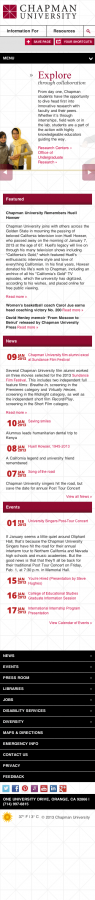
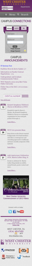
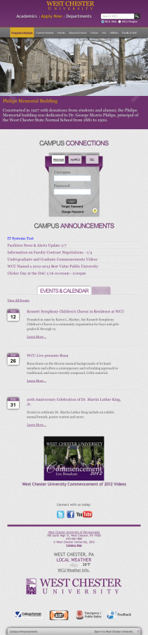
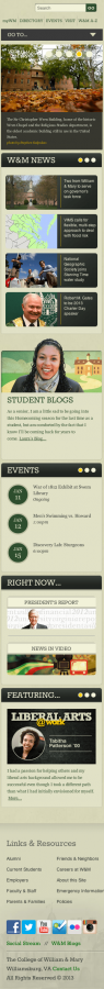
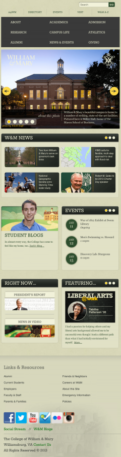
Notre Dame isn’t the only school moving toward responsive design, however. Below is a showcase of schools (each displayed here at 320, 640, and 970 pixels wide) that are also working toward a responsive strategy. While there is always room for improvement, I admire these schools 100% for devoting resources to projects like these, and understanding the importance of responsive and adaptive websites.


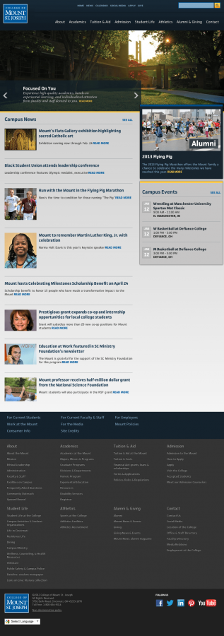


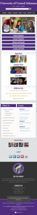
University of Central Arkansas


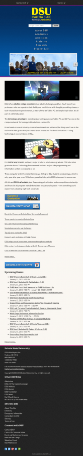
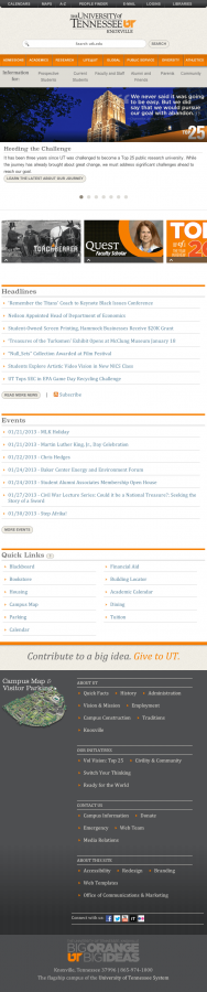
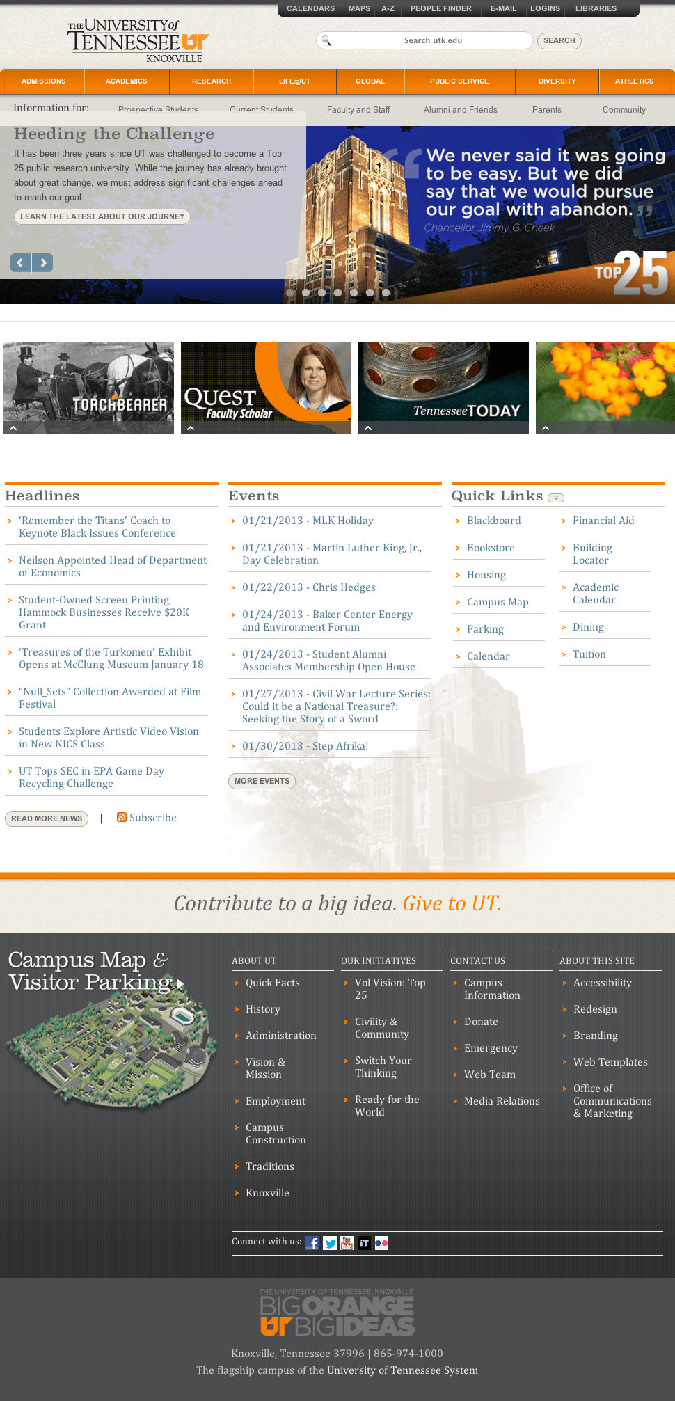
The University of Tennessee, Knoxville


Wrapping Things Up
If there are other colleges or universities that have also begun to take a responsive approach, I encourage you to leave comments below. And of course, for all of my fellow University of Miami fans out there, I say, “Go Canes!”