 ✔ Articles
✔ Blog posts
✔ Infographics
✔ Press Releases
✔ eBooks
✔ White Papers
All Check.
Great! Now it’s time to start thinking about including PowerPoint in your Content Marketing mix… PowerPoint has been around for a while, but the technology for this valuable program is continually improving. Unfortunately, however, PowerPoint is an often neglected tool that can in fact be used to create high quality content in a short amount of time. There are also many potential SEO benefits of publishing your PowerPoint slideshow on Social Media content sites like Slideshare.net.
What is Slideshare.net?
Slideshare.net has made it possible for business owners to leverage PowerPoint slideshow to rank higher in the SERPS (Search Engine Results Pages). Slideshare.net works like most Social Media sites in the sense that it’s all about active participation through uploading, “favoriting”, bookmarking, tagging, commenting, joining groups and embedding / linking slideshows on your website or blog. If you do all of the above, you’re more likely to be rewarded in the form of greater visibility of your slideshow and backlinks.
How to Create the Perfect PowerPoint for Slideshare.net
The best thing about PowerPoint is that you don’t have to be a Designer or Wordsmith to create compelling content with it. Quite the contrary! PowerPoint has been designed to quickly and simply create aesthetically pleasing, informative content. Not only is PowerPoint used for presentations, but it can also be used to create online content such as demos, step-by-step instructions, how-to’s and a variety of other creative and useful purposes. Use PowerPoint slideshows in your marketing campaign, share it on Slideshare.net and get indexed quicker by the search engines!
But first there are several strategies you need to master in order to create the ultimate PowerPoint for maximum user engagement on Slideshare.net. See below and dazzle your audience with quality content you never thought could be created in such a short time span!
Start out with a blank presentation and white template with basic black font. The most important thing you need for a successful PowerPoint with optimal Social Shares is to have a solid and organized foundation of information for easy user interaction. Before you even open PowerPoint, have an outline that sequences your content. Think in terms of slides, what should the first one be? How will it lead into the second? How will the second lead into the third and so on. Remember that people usually only skim written content, the first two slides should do that for them. Here’s how:
- Slide One – This should include the title of your presentation. For instance, if you’re explaining how to build a birdcage, title it “How to Build a Bird Cage in X Amount of Easy Steps.” Include a graphic that correlates with your topic. For this example, use an image of the finished product, or just some birds that look like they need a home. Depending on the gravity of your subject, it may be better suited by plain text and a minimalist background.
- Slide Two – Introduce the material, but be general. Don’t crowd the slide with words. You are not writing an article. Instead, create bullet points that cover the main ideas, topics or steps that your slideshow is going to incorporate. This is where you skim your content for your readers. If your PowerPoint is going to be instructive, list the tools and/or supplies they will need before proceeding. If you are methodically answering some knotty industry question, list the main question and the subsequent questions, topics and/or points that spring from it and will be covered in the PowerPoint. The purpose of an introduction is to give a brief overview of the main points. Avoid going into any kind of depth about any of these bullet points as each point will have one or more slides dedicated to expanding the idea. The idea here is to capture their interest and offer value.
- Slide Three – Use this to expand on your first bullet point. While you may be tempted to answer questions or give instructions in writing, this is NOT the point of PowerPoint (no pun intended). Use visuals to answer questions or to illustrate steps of a how to process. Try to incorporate some kind of infographic, chart, graph or some other visual means of sharing information. Make your points with pictures, not with words. Of course you can use words to further clarify the image, but the image should do most of the talking for you.
For more ideas, take a look at the following slides about ROI and use it as inspiration for your own PowerPoint:

If charts and graphs don’t apply to your content or you just don’t like using them, take PowerPoint to its full potential and try something a bit more creative, like this:
This slide perfectly exemplifies the art of showing, rather than telling. So get a hold of your information and turn it into a chart or a graph. If that doesn’t apply to your content, find other ways to get your information across using graphics. Always remember that PowerPoint is meant to be visual, not wordy. You’ll notice that your audience will appreciate this much more than having words and numbers scattered all over the place.
Quick Tips for Slideshare.net Optimization
- Title Keywords: Similar to a Meta Title. Choose the title of your slideshow carefully as it will become the title tag of the page. Optimizing the title is of upmost importance for maximum visibility.
- Summary Keywords: Similar to a Meta Description. You’re given a certain amount of space to write a concise yet informative summary that allows users and search engines to locate and decipher your content easily.
- Tags: This will assist Slideshare users to easily find your content amongst the numerous slideshows that exist in a myriad of topics.
- Large Text: Understand the importance of using large text in your slide show as your slideshow will be a lot smaller once it goes live on Slideshare.net. Make it easier for the user to read without them having to download it.
Pick a Theme and Stick with It
While you are crafting your slides, it is important to remember to follow a coherent pattern for the user’s sake. The last thing you’ll do is add design, but when you do so you want to make sure that your slides all relate to one another and have some kind of theme. I would recommend sticking to something minimalistic that doesn’t detract attention away from your graphics.
For example:

This design is both classy and minimalistic. It is bland enough to add focus to whatever graphics or words are placed there, but not so bland as to be boring or look stark.

Choosing solid colors that contrast, like the ones in the image above, is a great way to draw the eye and capture attention without being overwhelming.
Handful of Helpful Design Tools
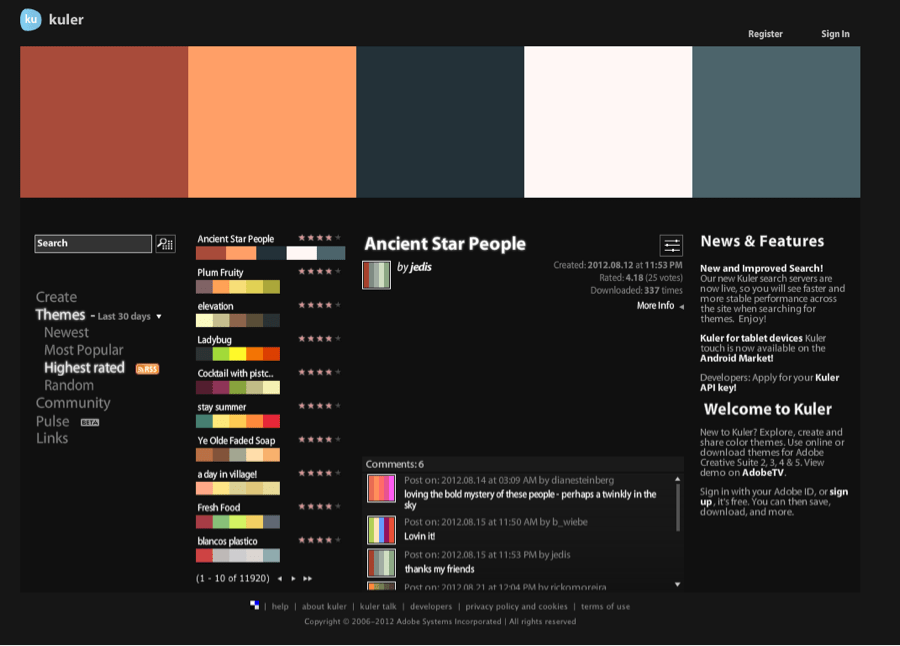
- Kuler is a design tool that stores multiple color palettes. Simply hover over the palette you are interested in and see if those colors are suited to the PowerPoint you are creating. Kuler even has options that let you sift through the “highest rated,” “most popular” and “newest” palette combinations to use as a template. If you’re feeling particularly creative, you can also design your own palette and submit it for rating. If you don’t have time to spend creating your own palette, then Kuler is the best tool for a time efficient and professional looking PowerPoint design.
Here is just one example of a palette on Kuler:
- 0 to 255 is another design tool worth taking a look at. Its main purpose is to find variations of any color to find one with the tone and shade that is exactly suited to the rest of your palette and your slideshow. The best thing about this tool is that after you have clicked on your desired color, it automatically copies it in case you want to enter the color setting in another program. This is my personal favorite because the color variations are much more ample.

- Last but not least in your design arsenal is a design tool called Piknik, also geared toward creating the ultimate theme for your slideshow. It is the most basic of all the programs and it only requires you to move the mouse as the color palette changes simultaneously. A great feature of this tool is the display that comes up at the bottom of your chosen color. With it you can change the luminosity as well as copy the color’s code before applying it to your settings.

More Useful Tips
- Remember that your content needs to be original. This axiom extends to your PowerPoints as well. Resist the urge to use premade templates unless you are absolutely pressed for time. I know, they are tempting, but don’t sacrifice originality just to save some time. No matter what media you are using, it is important to remember that taking the time to craft your content, to be original and make it eye-catching is worth it.
- Choosing a strong palette of colors can make a difference if your slideshow requires more text than graphics. When you do have a lot of graphics, lean toward the minimalistic. Make your slides simple but not simplistic. This way your visuals are not just stark naked on a white background, but aren’t overwhelmed by your background theme either.
- Using quality photography for your images can have a huge difference in the quality of your overall presentation. Not a photographer? Not a problem. Sites like Photobucket and Istockphoto are chock full of images with a high resolution. If you are looking for a background image for your slides, make sure that the image you choose has high megapixels and a high resolution. This will prevent your PowerPoint from looking cheap. Another great way to find images is to do a Google search for “Desktop Images” or “Wallpaper Images.” These tend to have a better resolution and are often fit for presentation templates. Choose one and save it in your documents. You’ll be amazed at what a difference it will make when you upload it. Another avenue to obtain quality photography is through social media sites like Flikr search or Pinterest.
Once you’ve conquered the art of PowerPoint and optimized it for sharing on Slideshare.net you’re ready to take full advantage of the SEO benefits this form of content has to offer.
Optimum7 understands the importance of using PowerPoint to express well-organized ideas visually for a plethora of uses, including presentations and online content creation. Creating great and engaging content is vital in all online marketing endeavors including SEO and SMO. View our Client Testimonials and contact us today to get started on your online marketing strategy.


