Clients and prospects often ask about design: “Should I do a template or custom design? I don’t have my brand guidelines. Should I redesign my site or redo my brand? In your opinion, for an eCommerce business, when does it make sense to do a full scope redesign?
Identify what type of eCommerce store you run. Are you a reseller or a true brand, meaning you’re selling your own unique products? Depending on the choice, your plan of action moves forward with either brand guidelines or even going into a new website design. Each is going to take a completely different course.
Creating Brand Guidelines for your eCommerce Redesign
Regardless of whether you’re a true brand or a reseller, you still need to have a solid set of brand guidelines. You’re still going to have a logo, color scheme, font selection that needs to be consistent throughout the entire site.
If you’re earning several million dollars in annual revenue, you are going to need to become a brand. And just think about it. From this standpoint, Amazon, Walmart, Wayfair, Jet, House, Overstock, and eBay compete for the market share in your niche.
If you think that these brands are not your competitors, you got to think again. Search for any home appliance on Google search results and you’re going to get these brands showing upThese are known brands. One of the most effective ways that you can represent your brand online is to have a good design, UI element, and conversion elements.
If you’re earning a million dollars, what would you say? Do you need to have a brand guidelines document?
Absolutely. Look at your core demographic. See if your design supports what that core demographic needs. For example, if you are a B2B business, and if you see that most of your customers purchased ten or more items, have a multi “Add-To-Cart” functionality on your category pages. The design needs to support functionality and vice-versa.
Successful Rebranding And Designing
Let’s talk about a custom design.
Somebody comes to us, they’re saying, “We’re earning X million dollars. After growing so fast, we even paid attention to design. Now we’re going to do a redesign and now we need those brand guidelines.”
How would you do a custom redesign on an eCommerce website?
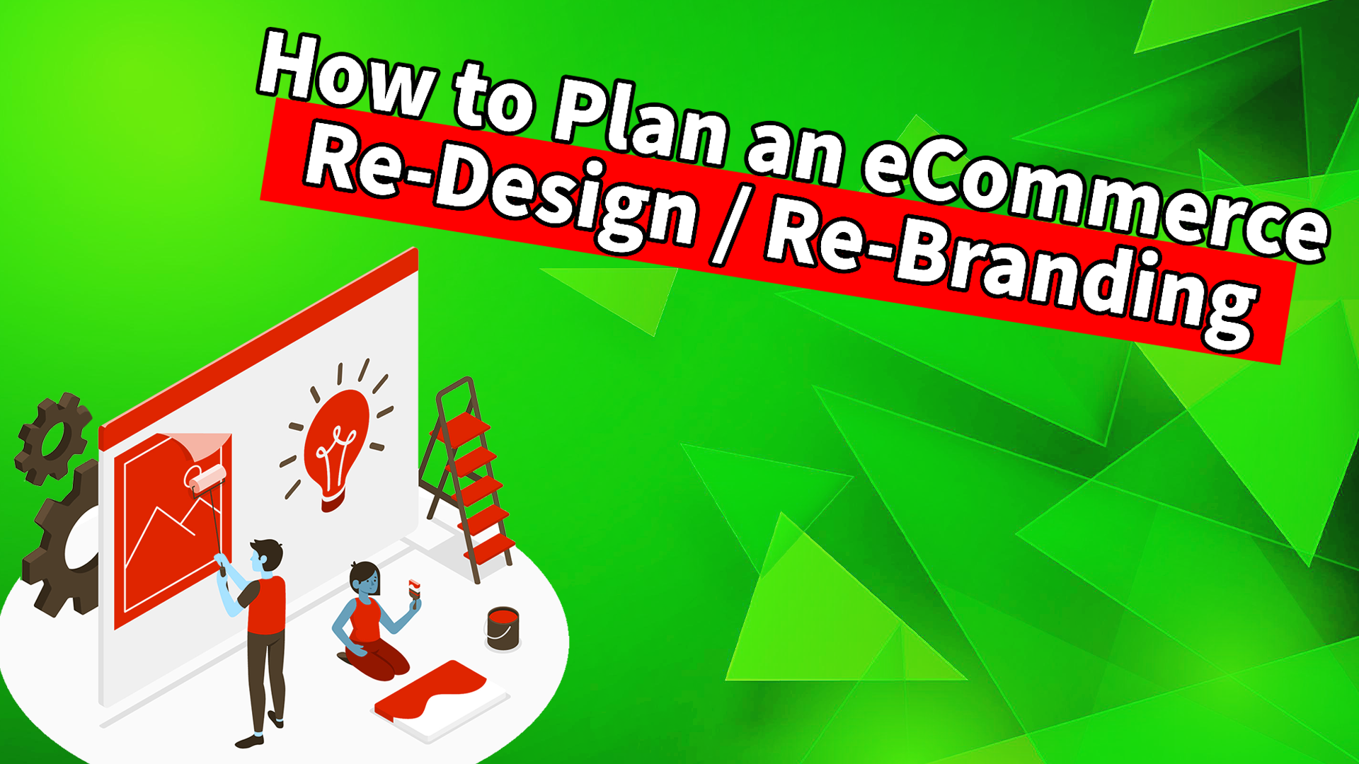
Marketers need mock-ups of the core sections of an eCommerce site. These are the homepage, category page, product page, and checkout. The mock-ups are either done in Photoshop or Figma, we’ll go ahead and we’ll review with the client to get their feedback. And again, there’s going to be some revisions, a couple of different rounds of revisions, a lot of back and forth when it comes to the design.
Small Businesses Working With a Marketing Agency: Don’t Be a Design Loser!
Trust your agency partner, especially when it comes to eCommerce because the experts look at what converts all the time. This results in ample back and forth when it comes to working with clients with design.
Markets are not thinking about your brand’s tone of voice but rather what your customers will actually click, how they will navigate, and how they will complete a purchase. Once the marketers go through these design revisions, then they go into the actual development of the design, incorporating functionality.
There’s a thin line. Here, you’re a huge brand, but there you’re a loser.
What does being a loser with design mean?
You’re stuck with the idea, design, representation of that brand that you don’t see anything else on the website. You just want it to look pretty and beautiful to wow visitors. Pretty websites do not convert.
The difference between that thin line is you can have a 0.5% conversion rate and have a beautiful wow website. Or you can have a 5%, 6%, 7% conversion rate and have a design that doesn’t wow people, but it’s clean and it’s simplified. Take the latter every single time.
The bigger the brand you are, the more leeway and creativity you have to go after that wow factor. You’re already a huge well-established brand and you know that people are going to buy from you anyway. They will go through the hassle of navigating through your site, look at the cool features, and purchase. Whereas if you’re trying to now scale your brand, you can not go out of the gates with a website that has inconvenient navigation.
Look at how fast Amazon loads. The company is not in the business of wowing people with website design. People love the stock price and functionality.
Amazon was the first to come up with the search and filter functionality, Prime, and an actually useful website. Not to forget the fact that their app is basically used on a daily basis by millions and millions of people.
Don’t forget that thin line between functionality and design. Once you have these mock-ups and you do the revisions with your agency or with your designer, look at an implementation. Then marketers start talking about the functionality. Do you need an advanced search and filter or a multi “Add-to-cart”? Optimum7 has built over 700 custom functionalities for platforms like BigCommerce, Shopify, Volusion 3D, Cart, Magento, MEVA, Episerver, and VTEX.
That conversation for functionality, however, needs to be planned at the beginning of the project but executed right after when you have your four mock-ups. And mock-ups unfortunately, most clients and prospects don’t understand this, but mock-up allows you to see that visual element before it’s actually implemented onto the site as HTML and CSS.
eCommerce Web Design that Converts
As previously mentioned, understand the demographic to create the right design. Furthermore, you have your analytics and the source of your traffic. Are they coming in on a mobile device or on the desktop? Design for where the majority of your clients are coming from first.
Many companies will do web mock-ups and then make them responsive for mobile after doing so for desktop. However, if over eighty percent of your traffic is coming from a mobile device, and that’s where you’re getting your conversions, design for mobile-first, and then worry about desktop after.
Implement a full redesign for your eCommerce website if it warrants it. Don’t spend a lot of money and waste time on the design if your conversion rates are great and only if you are truly trying to be a brand. If you’re a brand with a twenty-million USD revenue, you need to compete with people who might be doing fifty to one hundred-million-dollar revenue.
Do not exchange a good design for page speed; always simplify. You don’t need to have different design elements flying around on the home page. Remember simple is good. Take notes from Amazon.


