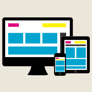
 I love responsive design. I think it’s an excellent concept that will soon become a standard throughout the web, just as cascading style sheets became a standard in the late 1990s-early 2000s. Will responsive design become the definitive solution for web designers for the rest of time? I don’t know. That’s probably what designers thought about 15 years ago when CSS was introduced, before they could fathom the myriad of devices we use to view websites today. My predication is that the web will continue to evolve and adapt depending on how users interact with it. But for the time being, and for the foreseeable future, I believe responsive design is (almost) always the way to go.
However, responsive design does present certain challenges, particularly in the mockup phase. It is difficult for designers to demonstrate to their clients the full potential of a responsive site using the Photoshop files that we have grown so accustomed to. In this article, I will discuss the mockup phase of a responsive site I am currently working on, how I presented it to the client, and why I believe it was a success.
Tip #1- Sketching, Researching, and Communicating
If you read my articles on a weekly basis, you know how I feel about the initial stages of the design process. You know that I find it absolutely essential to sketch and re-sketch, do thorough research, and ask plenty of questions. So you won’t be surprised that my first tip is to do just that.
While this phase is important during any design project, I find it crucial when working with responsive design. This is not only because you will need more information than usual from your client, but also because he/she will need more information from you. Like I mentioned before, responsive design is a relatively new practice, and it is likely that your clients will have to ask more questions to fully understand what it does and why it works. Be prepared to answer their questions, and to reassure them that they made the right choice in choosing to design responsively.
This first tip can be especially difficult because it relies heavily on our verbal communication, rather than the visual communication that designers are typically most comfortable with. We’ll talk more about this in a moment.
Tip #2- Don’t Go Crazy With Mockups
I’m serious, don’t do it.
The more mockups that you do, the more difficult your job will become, and the more confused your client will be. Responsive mockups are very different from static mockups. Responsive mockups should not be pixel-perfect images that display exactly where content will go, because ultimately you don’t really know where the content will go because it depends on the screen size. And you cannot design mockups for every screen size; that is just ridiculous and truly impossible. There are hundreds of screens that your site may be viewed on- desktops, laptops, mobile phones, tablets, televisions, projectors…the list goes on and on.
So where do you draw the line? How do you demonstrate what the site will look like without wasting the client’s time and your own?
To be honest, I’m still figuring this out too. I am actually varying my process from client to client until I can find what works best for me. In my most recent project, I chose to show 3 templates (the homepage, the blog page, and the standard page) at 3 screen widths (desktop/mobile, tablet, and mobile), for a total of 9 mockups. While this was a bit time consuming, the client had a very clear vision and we were able to move forward immediately. So was it worth it? In this case, I think so. However, with a more difficult, nit-picky client it may have been a big headache. One thing is for sure, with every process I test, I am improving. And what’s even better, with every test will come a new article for you to learn from!
Tip #3- Work with your Developers, or Better Yet, Develop Yourself!
A few weeks ago, I attended a student art show at my Alma mater, Nova Southeastern University. I love to attend these shows because all of the graduating seniors with graphic design and art majors get the opportunity to show off their finest work. It serves as a great experience for them, as they get to plan the entire show, and a great experience for me because I get to suck up some inspiration and interact with old friends.
While I attended the art show, an old friend of mine asked about my career in web design and how the process worked. She asked if I designed the websites in Photoshop and the passed them on to development. She was shocked when I told her that I worked hand in hand with development, and even coded most of the websites myself.
The moral of this story is that designers today must rethink the web design process of old. As designers, our responsibilities have broadened from architecture to include contractors and builders. Especially in smaller firms, it is fundamental that we become jacks-of-all-trades.
To everyone out there who is screaming, “I’m a designer, I don’t code!” I challenge you to find a job in about 10-15 years, probably sooner. I predict that designers who code, and coders who design, will become more prevalent and ultimately more desirable to potential employers.
Furthermore, I believe that a designer who codes will ultimately create a far superior product than a designer who cannot code. Let me explain with the following example.
At one of my previous jobs, I was asked to design websites to be outsourced and built in WordPress. At the time, this seemed like a pretty sweet deal- I got to make a masterpiece in Photoshop and someone else had to deal with implementing it in WordPress. But when I got the built-out sites back, I was often appalled with the results. I’d curse the name of the developer I didn’t know, and spend countless hours trying to find someone to fix the issues. Now that I look back, I know the problem wasn’t the faceless developer, it was me. I had designed sites without having any knowledge of how WordPress worked. How could I possibly create a functional site with no knowledge of how it would be built out? Had I known how to code in WordPress, I would have had a much better idea of how to design for WordPress.
Tip #4- Set Realistic Expectations with the Client
As I mentioned earlier, it can be especially difficult for clients to understand a responsive design concept because it relies heavily on verbal, rather than visual, communication. To help the client understand, and to prevent chronic project-related migraines, you need to set realistic expectations with your client. Explain that they will not be given pixel-perfect views of how the site will look on every device. Share your plan and process with them, so they know exactly what they are getting. If they object, you can hash out any details before a single wireframe is sketched.
Tip #5- Be Consistent
Consistency is key within most web design projects, but I find it incredibly useful during the mockup phase of a responsive project. With the project I am currently working on, I made sure to organize and group my Photoshop layers so I could simply copy, paste and modify them throughout the documents. Once I had the homepage completed, creating the rest of the mockups was a breeze.
The Takeaway
Although responsive design is a fairly new, and very different practice from what most web designers (present company included) are used to, it is one that is here to stay, at least for a while. We need to work together to come up with the processes that best suit our needs, as well as the needs of our clients.
Is your site ready for a responsive redesign? Contact us today for a free consultation!


