 Like many employees around the world, last week I took a vacation. I was out of the office from December 24 to January 1. It works out to be a total of nine, glorious days when you include the weekend.
And it was truly long overdue.
It was the first time since 2005 that I’ve had a true Christmas vacation – with no work, and no school. Folks, that’s nearly a decade. And I am truly too young for that.
For those who know me, you know how difficult it can be for me to say no to work. I’m that employee who comes in when I’m sick (and, admittingly, infects the entire office) and rarely takes time off. Unfortunately, the more I read, the more I’m convinced that this type of “work ethic” is in fact toxic to an employee and to a workplace. Research has shown that vacations actually help you to live longer, give you more energy on a daily basis, enhance creativity, make you more productive and happier at work, and even improve your home relationships.
After all my research, I was finally convinced it was time for some time off. But I didn’t want to simply pick up and leave, of course. I wanted to make sure that all my clients were taken care of. I then read an article that suggested taking a vacation during the last week of the year. It explained that the last two weeks of the year are basically the least productive of the year, and that many people take time off so turnaround time is not typically as strict as the other 50 weeks of the year.
And so it was decided, I’d take time off at the end of the year. I requested the time off way back in the beginning of October and made a plan to make all clients and coworkers aware of my absence. In addition, I made sure that there were detailed instructions for any loose ends that might need to be tied up during my vacation.
While on vacation, I had the opportunity to rest, relax, enjoy friends and family, and reflect on the past year. In this week’s post, I’ll discuss some reflections from 2013, as well as discuss what they mean for 2014.
Here we go!
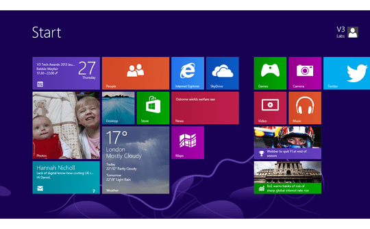
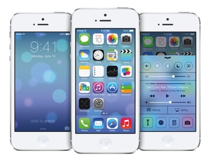
Reflection #1: Flat Design and Simplicity
In the past few years, we have seen the emergence of clean, simple web design. Though this is certainly not a new design concept, I’d argue that it’s relatively new for the web. In the past websites have become monstrosities filled with heavy images, JavaScript, etc. In the year 2013, we saw many redesigns that demonstrated the usefulness of a flat, simple design.
Take the interfaces of Windows 8 or iOS 7 as an example:
Reflection #2: Be Purposeful
Although I already knew that design is nothing without purpose, changes in 2013 have done nothing but reinforce that attitude. With algorithm updates like Panda, Penguin, and Hummingbird, Google is making it very clear that our content should be purposeful, relevant and useful. Gone are the days of slapping infographics together for infographic’s sake. All things we do, all decisions we make, must have a clear purpose.
Reflection #3: Usability
In 2013, I had the opportunity to truly delve into the world of usability testing. Usability testing helps to improve our sites, and to recognize our faults. With usability testing, we are able to put ourselves in the user’s shoes and understand what makes them tick, what they like, what they dislike, and what encourages them to carry out a specific call to action. If you haven’t started usability testing on your client’s sites yet, I’d suggest you check out a couple of my recent articles: A Beginner’s Guide to Usability Testing or Efficiently Testing and Reporting Web Site Usability.
Reflection #4: Responsive Web Design
I’ve written about this again and again, but it’s 100% worth mentioning here. Responsive web design will be a great tool as we move forward in 2014. I don’t believe it is the perfect solution for every situation, but it definitely helps us transition the “traditional web” and “mobile web” into a single entity.
Reflection #5: The Fold Doesn’t Exist
In the past (and sometimes in the present) you may have heard marketers or designers discussing how all important information needs to be “above the fold.” This is a reference to the Internet’s cousin, the newspaper. This use to be quite relevant because many users had rather slow connections and may not even have the patience to load an entire page, much less an entire site. But today, with the speed of most Internet connections, pages load rather quickly – especially when built well. Not convinced there isn’t a fold? Check out this site and tell me what you think in the comments.
Reflection #6: Larger Fonts
With more and more users viewing sites on tablets and mobile phones, readability has become a huge issue. One solution for this problem is the use of larger fonts. No one wants to hold a phone or tablet 5 inches from their face, so do your user a favor and test your sites. How far away do you have to hold your phone? Do you have to do a two-finger zoom in? Adjust as necessary.
Reflection #7: Enough with the Hover Effects
This reflection ties in with #1 and #4. With many users visiting sites from touch screen devices, hover effects are becoming more and more obsolete. When designing sites in 2014, ask yourself how important a hover effect is? What would the consequence be if the user never even saw it? If the consequence is small, you can probably lose the hover altogether and streamline your design. If the consequence is greater – for example, your user won’t be able to see important menu options – you may need to consider a new option or restructure the site.
Reflection #8: Users want Content
As I mentioned in reflection #2, purpose is key to Internet marketing and web design success in 2014. We must not only produce useful, purposeful content for our users, but also make it accessible. Users shouldn’t get lost when they land on your site. They should be able to easily find what they are looking for and enjoy it. In addition, staying on site should be pleasant. Have you ever traveled to a site with related articles on the sidebar that you click to open in a new tab before you even finish reading the current page? I know I do. Before I know it, I’ve read four articles on a site without realizing it. This is what I’m talking about. Make great content, and make it easy to find, and your users will be thrilled to find and stay on your site.
Reflection #9: The Power of Perseverance
During my vacation, I watched a TED Talk by Angela Lee Duckworth called “The Key to Success? Grit”. She discusses how the most important factor in fulfilling your dreams is not money, it is not talent, it is not even intelligence. It is the power to persevere through hard times and learn from our failures. Check out the video below to see what she has to say about grit’s place at work.
[ted id=1733]
The Takeaway
2013 taught me a lot about web design, and even more about how important a work-life balance can be. After reading this post, I hope that you will go into 2014 learning from mistakes, but not dwelling on them. I also hope that you will produce great content that is easy for your users to find and create simple, purposeful solutions that will produce excellent results for your clients. And of course, I hope that in 2014 you will take a nice, long, well-deserved vacation from which you will return to work refreshed and full of new ideas. ;-)
Looking for a web designer who is always looking to the future? Contact Optimum7 for a free consultation today!