I love type but it is something that I am, admittingly, still mastering. This is mostly because I don’t have as much time as I’d like to practice and experiment with typography. But this week, I’ve set aside some time to do a little reading and brush up on my typographic skills. This post will serve as a recap for this refresher.
What is a typeface?
According to James Craig’s Basic Typography: A Design Manual, a typeface is “a specific design of an alphabet.” Some examples of typefaces are Baskerville, Helvetica, Futura, Times Roman, or Arial.
Now, I’d like to get a little something off my chest. The words “font” and “typeface” aren’t meant to be interchangeable. This is somewhat of a pet peeve of mine. A “font” is actually a “complete alphabet of one size of one typeface.” Basically, font refers to a size of a particular typeface, while a typeface refers to the entire typeface no matter what the size.
The History of Type
Before modern type, monks would scribe books by hand, which was obviously very slow and inefficient. Johannes Gutenberg is given credit for introducing printing to Europe. His invention of mechanical movable type, known as “Blackletter” was a monumental event in the modern period.
Of course, there are several periods between then and now that have influenced them but perhaps the best, most concise history I’ve ever seen can be viewed here:
Parts of Type
There are many pieces that make up type. To help you understand what type is and how it is used, it is important to familiarize yourself with these pieces. Below I’ve created a little “glossary” defining some of the most important terms, as well as a diagram to help you visualize. These definitions also come from James Craig’s Basic Typography. I absolutely love to reference this book, and definitely recommend it for beginner graphic designers, seasoned typographers, or even clients who wish to become a bit more knowledgeable on the subject. Please note that there are several other important terms, but for the sake of this post, these are “the biggies.”
*Bonus- at the end of this article, you can download this guide as a free PDF!
- Baseline: The imaginary line on which all the capitals and most of the lowercase characters appear to stand.
- Meanline: The imaginary line that marks the top of lowercase letters lacking ascenders.
- Ascender: The part of the lowercase letter that rises above the x-height.
- Descender: The part of the lowercase letter that falls below the baseline.
- Counter: The enclosed or hollow part of the letter.
- Serif: The short stroke that projects from the ends of the main strokes. Not all type has serifs; type without serifs is called sans serif, which is French for “without serif.”
- X-Height: The height of the body, or main element, of the letterform. The x-height is actually the height of the lowercase x.
Why is typography important?
Now that you have a basic understanding of what type is and where it comes from, it is now time to understand why typography is important. There are several different arguments for why typography is so important in design, but in this article I will cover my favorite three.
Branding
The first, and most obvious, reason that type is important is that consistency in branding is crucial for successful businesses. Corporations spend billions to research how their brand should be perceived and how to ensure the brand is actually perceived as intended. Let’s take Target for example.
Target’s logo and signature red is highly recognizable on both their website and in print ads.
Notice anything else about these images? There is also consistency in the type choices. Nearly all body copy is sans serif, reflecting that of the Target word mark, with the exception of the decorative text used to represent upcoming holiday sales.
This consistency gives the user/viewer/customer a sense of order, and thus, trust.
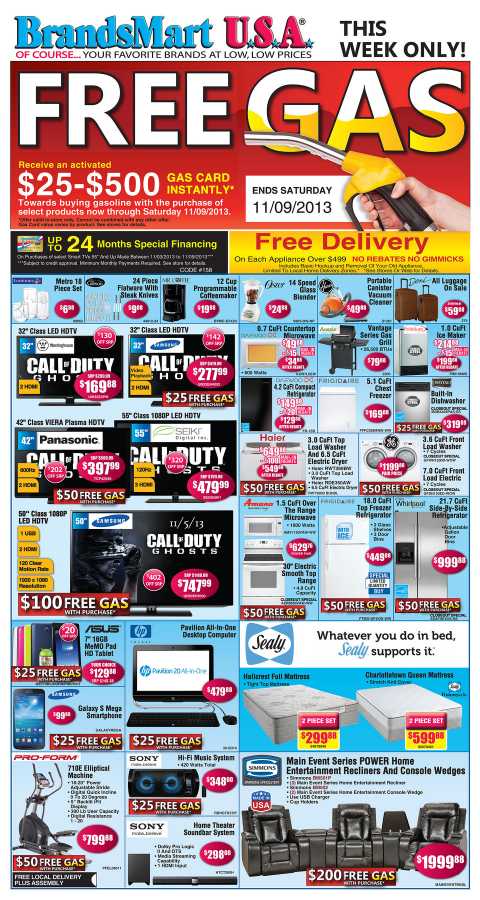
Let’s take a look at a company whose typography isn’t as consistent.
Goodness gracious, that gives me a headache. I’m sorry you have to see that folks, but it’s for educational purposes. This ad is an absolute mess, and we could discuss grids and balance all day, but this post is about typography. Check out the inconsistencies here. There are several different typefaces, in several different sizes, all with different type treatments (drop shadows, borders, colors, gradients, etc.).
All of this contributes to a look of chaos. When I see an ad like this, I imagine myself being transported to this chaotic store, full of people, signs, and perhaps even appliances, fighting for my attention. I imagine that I’d barely get out alive, when suddenly I realize that I don’t actually have to go to this tumultuous house of terror. Instead, I am free to wander the aisles of Target where their hypnotic logo draws me in, gently nudging me to put another item in my basket.
Type is A Language of Its Own
In The Elements of Typographic Style, Robert Bringhurst writes that “In a world rife with unsolicited messages, typography must often draw attention to itself before it will be read. Yet in order to be read, it must relinquish the attention it has drawn.”
Think about those words for a moment. Designers must use typography to deliver a message, without the reader becoming distracted by the message of the type. This is not an easy task. Bringhurst later writes, “Letterforms have tone, timbre, character, just as words and sentences do. The moment a text and a typeface are chosen, two streams of thought, two rhythmical systems, two sets of habits or if you like, two personalities, intersect.”
Typefaces have distinct personalities that designers take advantage of to subconsciously convey meaning.
To me, a designer’s job is very similar to that of a translator. We use symbols – color, signs, images, placement, and, of course, type – to visually communicate a concept. These messages can be overt, subtle, funny, thought provoking, conscious or subconscious, but they almost always cue some sort of emotion.
Type is Necessary
Many designers, myself included, are very familiar with clients who don’t understand or value the power of typography. For those clients, I like to quote psychiatrist Paul Watzlawick, “one cannot not communicate.”
So what do you do if a client demonstrates his lack of attention to type by explaining how he simply opened up a Word document this morning, typed in an office memo using the default settings, and printed it out without even thinking about how it looked?
You tell him he is wrong.
Once he calms down, you can explain that although he didn’t think about it, he made a decision to keep the default settings for this memo, probably because he wanted to seem professional but not fancy.
If he doesn’t understand, tell him to watch this YouTube clip. It is a scene from the 2006 The Devil Wears Prada starring Anne Hathaway and Meryl Streep. In this clip, a team of designers agonizes over fashion decisions, when Hathaway quietly snorts at the “ridiculousness” of it all. Streep then explains how through fashion (like type!) you cannot not demonstrate a decision.
The Takeaway
Typography is a very modest player in the design world. Type is used in nearly all design work, but rarely noticed. It’s a very powerful communication tool in the design of logos, print ads, books, websites, packaging, products and much more.
Are you looking for a designer who will effectively utilize typography to communicate your brand to your target audience? Contact Optimum7 for a free consultation today!
Click here to download a free copy of the Optimum7 Typography Guide!


