 As Election Day draws nearer, I am more frequently bombarded with a tornado of political opinions and questions. Who will you vote for? You can’t possibly be considering voting for that candidate! How do you feel about this issue or that?
Well, to be honest, I haven’t yet made up my mind. Oh, you haven’t either? Fear not, friend, you are not alone. We are lumped together in the category of what I like to call The Undecideds. However, as a responsible voter, what is the first thing we can do to step out of this category? We could ask our parents who to vote for, but they may end up inadvertently pressing their political opinions on us. Or we could pick up a newspaper and do some reading – oh, wait I forgot what year it is. The most logical answer is to conduct online research. In my search for the candidate who you feel has beliefs most aligned with your own, you will first most likely stumble upon the candidate’s official website homepage. In this article, I will be taking a closer look at both Mitt Romney and Barack Obama’s online presence.
Firstly, let me explain what this article is not. This article is not endorsed by either political party, nor is it endorsement of either party or candidate. It is not going to tell you to vote this way or that. It is not going to discuss what either candidate supports or doesn’t support. This article will review each candidate’s homepage and landing page from my purely design-based perspective. I will be analyzing color, effects, layout, use of a grid, photo choice, placement, etc. I am not here to sway you in one direction or the other. I am simply taking a very current topic: the presidential campaign, and putting it under my designer magnifying glass. So if you’d like a politically biased update on who to vote for, sorry, go back to your Googling. But if you’d like a look into how each candidate is being presented online, continue reading. Let’s begin with our incumbent, President Barack Obama.
BarackObama.com
When you first travel from your search engine of choice to the official Barack Obama website you will initially land on the following page.
Obviously, this is not the Barack Obama homepage. This is a landing page. On this landing page, it is very clear what action the user is supposed to take. Fill out the form. But what design elements lead us to this conclusion? Well friend, this is where I come in.
Consistency
At both the top and the bottom of this page is the official Obama-Biden logo. This ensures the user that he is in fact headed in the right direction. After recognizing the logo, he is unlikely to leave the page in search of a different, more accurate site.
Photography
The photograph chosen here speaks volumes. The photo does not show Obama shaking the hand of a rich banker, or assisting a homeless man. On the contrary, Obama is not reaching out for a single person, but a group. And not just any group- a group made up of smiling men, women, and children of all ethnicities. By using this photo, Obama is shown to have widespread support from people of all colors and creeds.
In addition, you will find that the photo is actually a bit blurred in places. Notice the wristwatch. It is not absolutely clear. This demonstrates action. This can be interpreted in two ways. First, that he is so involved in the people, and so genuinely interested in meeting every single one, that he simply can’t keep still. The second, arguably more powerful meaning, suggests that Obama is a “man of action”.
Allow me to direct you to where President Obama’s gaze is set. He is looking directly at the form. This is no coincidence. Recent studies have shown that a user is more likely to interact with whatever the subject in a photograph is looking at. This is just another tool the designer used to make sure the user understands what to do upon landing on the page.
Finally, I think it is important to note that the photo is set in black and white. The purpose here is twofold. First, the black and white appeals to the nostalgia of the “good old days” and to more traditional values. In addition, when placed in black and white, the form is much more prominent on the page.
Text
The text on this page is direct and concise. It features only one question “Are you in?” and only one answer: “I’m in!” In addition, the form features only two fields: email and zip code. It isn’t too personal, but it is enough to commit. The “I’m in!” button is set in red, so the eye is immediately drawn to it. This is done purposefully, so as soon as the user lands on the page, they immediately know where to click.
Criticism of the Page
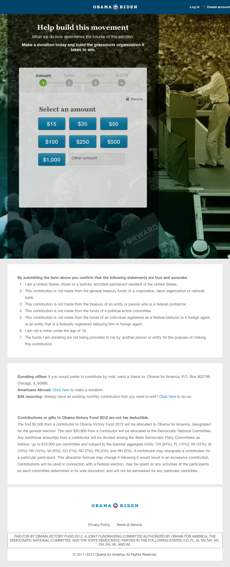
My harshest critique of this page is the lack of an option. While I commend the designer for giving the user a clear call to action, he has failed to consider people who are not yet “in”. What about my fellow Undecideds who simply want to learn more about the candidate? They can click the Obama-Biden logo at the top center of the page, but they then land upon this page:
While I once again commend the designer for the aggressiveness taken here. It is very clear the action the user is to take- donate to the campaign. But once again, as a user who simply wants to become more informed, I am left a bit frustrated. So I again click the Obama-Biden logo at the top, and finally reach the Barack Obama homepage.
The first thing you will probably notice about this page is the header consistent with the previous two pages, once again reassuring the user that he is in the right place. However, the designer has added a button for donations and a link to the Obama online store, and the word “forward,” set in multicolor, uppercase sans-serif letters. This, like the photo, reinforces the idea that Obama is a man of action.
Next, there is a primary menu with three main options:
- Get the Facts
- Get the Latest
- Get Involved
These menu items are put into a highly logical order for the average undecided user, as we read left to right. Naturally, the Obama administration is hoping that a user would look into the information for the Obama campaign, in the Get the Facts section, become excited and want to learn more about what is going on currently in the Get the Latest tab, and finally, convinced of this candidates platform, move to Get Involved.
Next is a large photo, with a two-field form calling the user to donate money. Once again, I would like to point out that the designer is using Obama’s line of vision to highlight the form and call to action.
Below the photo, the website is split classically into a main content section and a right aligned sidebar. Each side is jam-packed full of calls to action to donate, volunteer, share, vote early, find and attend an event, call voters, send an eCard, and get details, etc. While I appreciate the vastness of options here, I do find the design of some of the call to actions to be a bit inconsistent. For example, in the right sidebar, I see that the Find An Event button is set in green. Stylistically, I find this to be a very odd choice. The only other place on the page where this same shade of green is shown is in the “Donate Now” button mentioned above. There, I believe it makes sense, as it is the page’s main call to action. But beneath the map, it doesn’t make sense. Did the designer truly want to place so much emphasis on this button? Perhaps. I could be completely incorrect here, but I think this emphasis is misplaced.
Additionally, the “Quick Donate $5” button is a completely different style from not only the call to actions, but from anything else on the page. I do think that this is an excellent idea- as a “quick donation” of only $5 seems like an easy way to donate to the cause, if a user was on the fence about doing so. However, a more consistent look would have been more appropriate.
Interaction
I would like to highlight the interaction between users and the site here. As I stated above, there are plenty of options for the user, and many opportunities to interact. By integrating Facebook, Twitter, and Google+, users can stay current with the latest campaign news and trends. In my opinion, one of the most interesting aspects of the site can be found in the footer of the page, in the “connect” column. In this column is a link to Spotify, a music streaming service originating in 2008. When you click on this link, it takes you to some of the president’s playlists, including: 2012 Campaign Playlist, Supporters Picks, and even Michelle’s Workout Mix. I found this to be such an interesting way for users to connect with the candidate, on such a personal level.
MittRomney.com
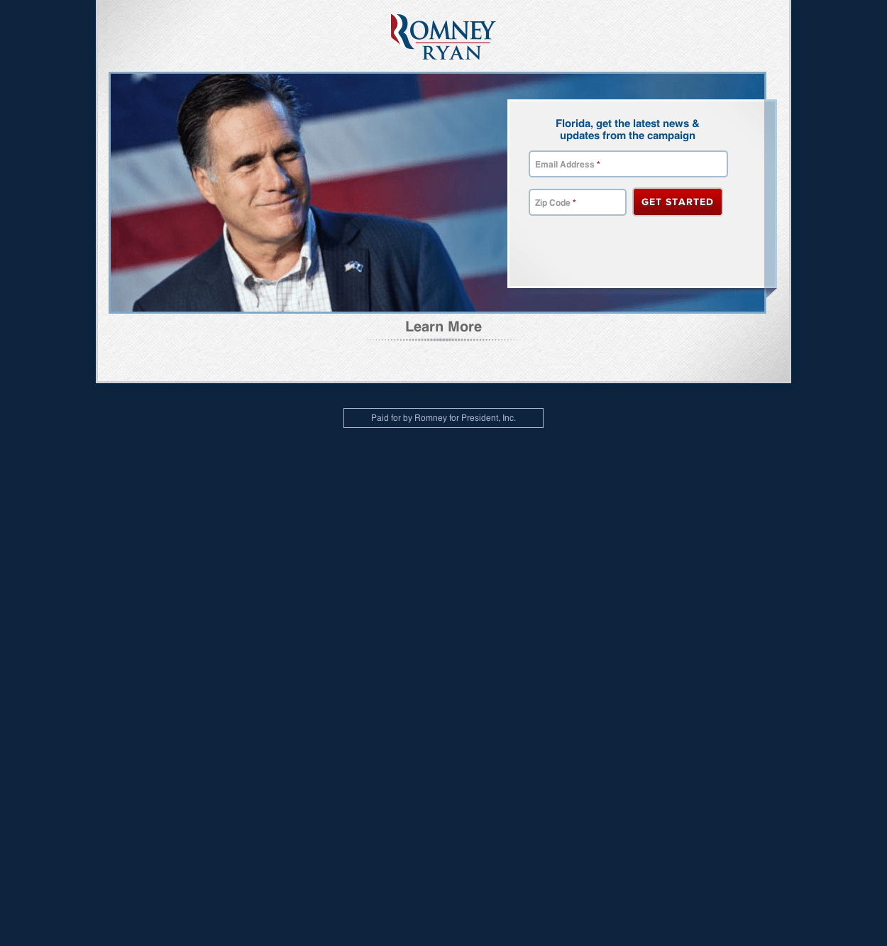
On to the challenger’s site. Once again, we are greeted with a landing page.
Seeing Double
Well, this seems rather familiar. The layout is almost identical to Obama’s landing page. (I’d like to point out here that I am not implying in any way that either candidate copied the other. On the contrary, perhaps this is a layout that simply works.) For example, this designer is again using the candidate’s gaze to draw attention to the form and using a red button to call attention to what is important.
Photography
However, there are a few key differences between the pages that I’d like to point out. Firstly, the photograph is in color. I suspect this is to demonstrate a sense of youthfulness, a demographic that is not stereotypically associated with the Republican Party. Secondly, the photograph only includes Mitt Romney and an American flag background. This is a harsh contrast from Obama’s photo. While you can interpret this as Mitt Romney, standing alone for America, critics may disagree and describe the image as an ode to Romney’s less than humble roots.
Text
Next, I want to point out that on this page, Romney has targeted a specific geographic location. The text reads, “Florida, get the latest news & updates from the campaign”. Targeting my current location demonstrates an attempt to further connect with the user.
An Emergency Exit
Finally, I’d like to commend the designer for an aspect that I believe the Obama page lacked. Here, the user is given an “emergency exit”. As I stated earlier, perhaps we aren’t yet ready to stand with Obama, or commit to Romney. Maybe we just want to become more informed. Here the designer gives us the option to simply, “Learn More”. In addition, instead of being taken to a second landing page, we are taken directly to the Romney homepage. As an undecided voter, this is a very appreciated aspect.
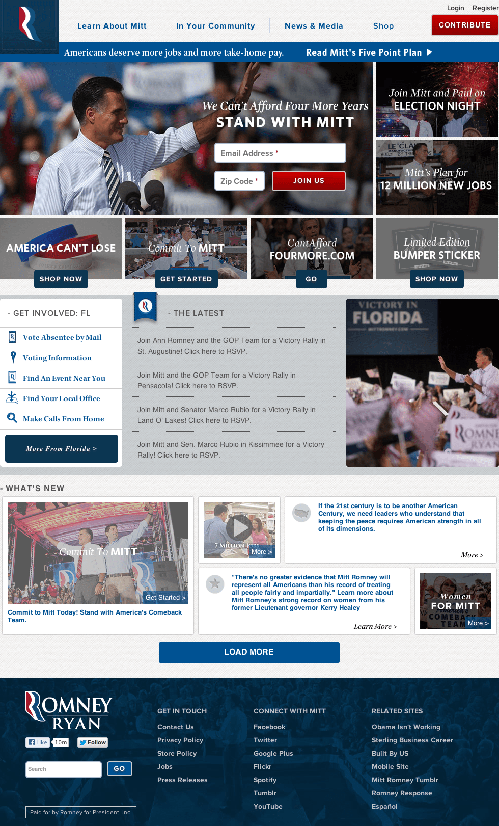
Once the user reaches the homepage, he is a bit bombarded with options. The layout is more compact then the Obama site, which can make it appear cluttered. However, I don’t believe the seven photos just below the header are helping matters. While the six images surrounding the main image are darkened, I don’t think the effect is enough to create a clear sense of visual hierarchy.
Consistency
However, I do think that the Romney site has more consistency between the call to actions. The most important buttons, Join Us and Contribute are red, in capitalized letters with the same rounded gray border. However, the link at the bottom of the sidebar which reads More From Florida (or whichever state you are located in i.e. dynamic content) is set in an italicized, serif font that differs from the rest of the calls to action.
Navigation
Another interesting aspect of the Romney site is the choice to allow the top navigation bar to remain at the top of the page as the user scrolls. While the Obama site follows suit here, the three main menu items on that site don’t travel with the user. I believe the Romney navigation increases the ease of usability and navigation throughout the site.
The Footer
In the footer, the designer has set an image of Romney giving a speech among a large audience. However, the photo has a dark blue overlay. I like this choice quite a bit. The color is consistent with the rest of the site, and increases the legibility of the links. In fact, I’m a bit disappointed that this effect wasn’t used in the six photos I discussed above. It would have tied the site together more, and allowed the two field form at the top to become a much stronger point of focus.
Interaction
Once again, I cannot express the value of social media enough. It is the quickest, easiest way to connect with your audience on a large scale. The fact that all of the messages aren’t necessarily political is crucial. Once again, we find Mitt Romney’s On The Road Spotify playlist within the footer- an excellent way to connect to your audience.
Conclusion
While I could go on and on, and delve deeper and deeper into both sites further analyzing each photograph, serif, and hue, this post is meant to be an article, rather than a book. However, I’d like to focus on a few things that designers can learn from these sites.
Don’t aggravate your users; give them what they want.
I’ve said this time and again, but I can’t emphasize it enough. You need to make your site as easy to use and easy to navigate as possible.
A picture is worth a thousand words.
Choose your photography wisely. A photograph can evoke emotion, set the tone for a site, and create a basis for a color scheme. Be sure that your images say what you want them to say.
Consistency is key.
Every aspect of your design should be purposeful. If someone asks why a designer made this choice or that, the answer should never be, “because it just felt right.” That simply does not cut it. Constantly ask yourself why you making certain decisions while implementing your designs and you should never run into this problem.
Provide a call to action, and information.
Every site should have a strong call to action, or an offer. However, this call to action is useless without information to back it up. If information is nonexistent, or difficult to find, your user will lose faith in your site and product.
Research your competitors.
As I mentioned above, I don’t think that either designer copied the other here. However, I think we’d be foolish to think that either party doesn’t research the other. Follow suit here. What are you competitors doing? Is it working for them? Don’t commit to your current strategy simply because it is your current strategy. Do research, learn from other people’s mistakes, and improve.
Use social media to your advantage.
Both candidates have listed all their links to social media in the footer. Some of these include Facebook, Twitter, Google+, Flickr, Spotify, Tumblr, YouTube, Instagram, Pinterest, and Storify. Build a following, and keep them updated on the goings-on within your business. However, be sure not to bombard them with information on sales only. Provide them with information of actual value, like relevant articles they may be interested in or useful freebies. Remember how I spoke about the candidate’s Spotify playlist? What do your employees like to listen to? Perhaps you could compile a playlist and add a link, just as the candidates have done on their sites.
So, who will I vote for based on this information? Come on friends, that’s way too personal. :)
